Fig. 12.
Download original image
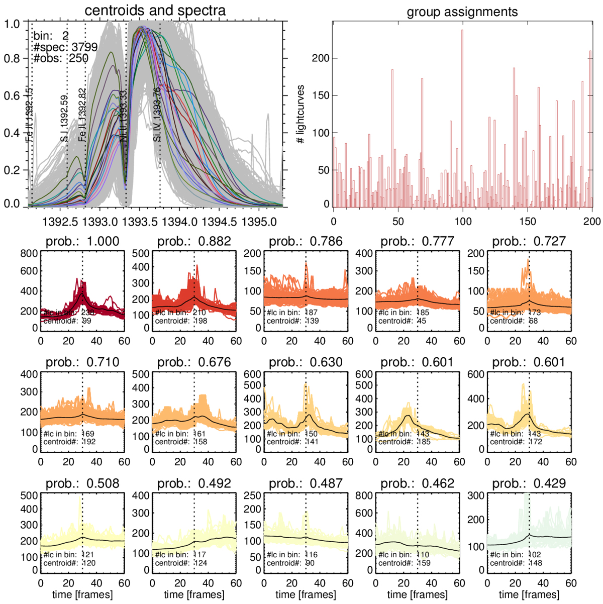
Example of the light curve analysis, here for AIA 1600. For a given burst type (top left panel), the representation of the classification (k = 200) is plotted in a histogram (top right panel). The panels below show 15 of the 200 light curve classifications, ordered by most often to least often occurring, with the same color-coding as used throughout the paper. In this example, it is obvious that most light curves show a peak at the thirtieth frame, which is marked by a vertical dotted line and corresponds to the IB time. This indicates that IBs are statistically observed simultaneously in IRIS and AIA 1600. Similar plots (not shown) were used for the analysis of all other AIA wavelengths and burst types.
Current usage metrics show cumulative count of Article Views (full-text article views including HTML views, PDF and ePub downloads, according to the available data) and Abstracts Views on Vision4Press platform.
Data correspond to usage on the plateform after 2015. The current usage metrics is available 48-96 hours after online publication and is updated daily on week days.
Initial download of the metrics may take a while.