Fig. 7.
Download original image
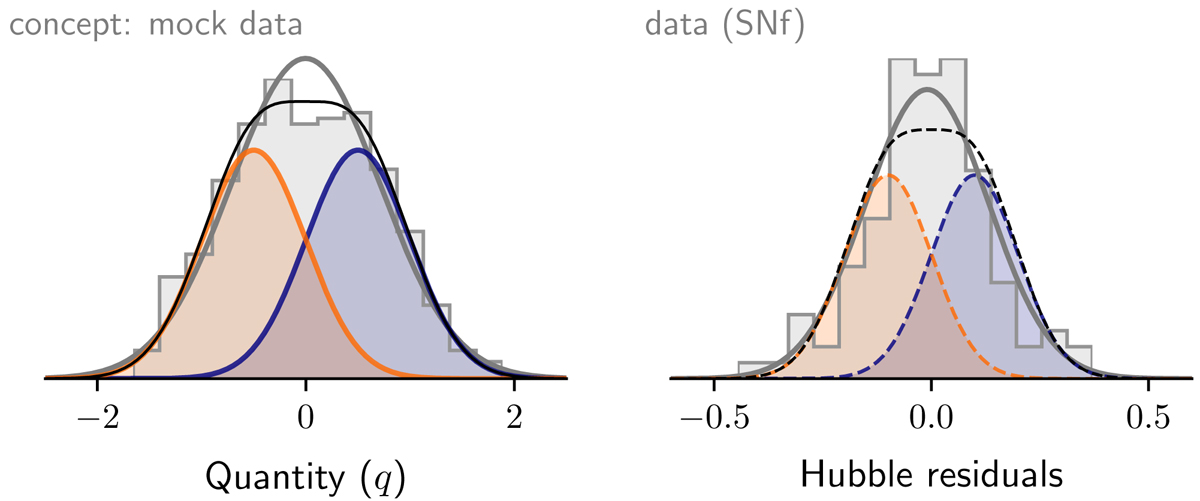
Illustration of the scatter in the two-populations model. Left panel: distribution of quantity q for the same mock data as in the top panel of Fig. 1, represented by the gray histogram. The full thick gray line shows the Gaussian parameters associated with this distribution. The blue and orange curves represent the estimation of the q distribution from the a and b populations, respectively, while the black curve is their sum. Right panel: distribution of the Hubble residuals of the SNfactory dataset, represented by the gray histogram. The full thick gray line shows the Gaussian that parameterizes this distribution. The dashed orange and dashed blue curves show the expected distribution of the two underlying populations that would explain the full intrinsic distributions (see Sect. 6.3). The dashed gray line is their sum and should be compared to the histogram.
Current usage metrics show cumulative count of Article Views (full-text article views including HTML views, PDF and ePub downloads, according to the available data) and Abstracts Views on Vision4Press platform.
Data correspond to usage on the plateform after 2015. The current usage metrics is available 48-96 hours after online publication and is updated daily on week days.
Initial download of the metrics may take a while.