Fig. 2.
Download original image
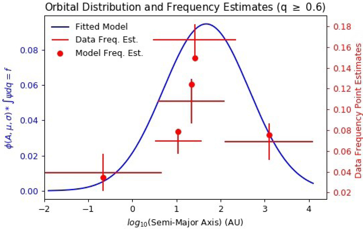
Comparison of the binary fraction survey data to the fitted model. Each of the red horizontal lines represent one of the five binary fraction estimates from the literature. The right vertical axis position of these lines is the binary fraction reported in the data and the span along the horizontal axis of these lines is the range in semi-major axes that the respective data cover. The red vertical lines are the error in these binary fraction estimates. The blue curve is the fitted log-normal model of the orbital separation distribution. Each red dot is the binary fraction estimate obtained by integrating the fitted model over the range of semi-major axis respective to each referenced survey. When visually assessing the validity of our model, the most important aspect of this plot to notice is that each red data point fits within each red vertical line, implying that our model replicates the referenced binary fraction point estimates within the errors.
Current usage metrics show cumulative count of Article Views (full-text article views including HTML views, PDF and ePub downloads, according to the available data) and Abstracts Views on Vision4Press platform.
Data correspond to usage on the plateform after 2015. The current usage metrics is available 48-96 hours after online publication and is updated daily on week days.
Initial download of the metrics may take a while.