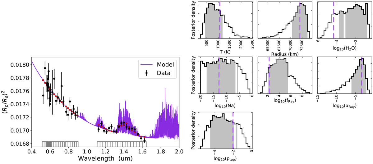
Fig. 11

Download original image
Left: best-fit spectrum when the WFC3 and O2 data are included. Black points denote the data with uncertainties, while the red points denote the best-fit spectrum integrated over the bandpasses of the observations, which are shown in gray at the bottom of the panel. Right: marginal posterior distributions (histograms). The shaded gray areas denote the 68% confidence intervals of the respective distributions. The purple dashed vertical lines denote the retrieved best-fit parameter values. The pair-wise correlation plots are similar to those shown in Fig. 10, displaying same nonlinear correlations and degeneracies.
Current usage metrics show cumulative count of Article Views (full-text article views including HTML views, PDF and ePub downloads, according to the available data) and Abstracts Views on Vision4Press platform.
Data correspond to usage on the plateform after 2015. The current usage metrics is available 48-96 hours after online publication and is updated daily on week days.
Initial download of the metrics may take a while.


