Fig. 7.
Download original image
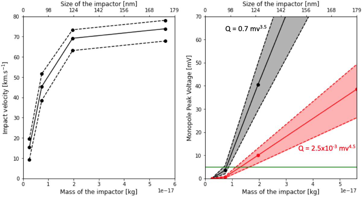
Model for velocity and voltage peaks as a function of the impactor’s mass or size. Left panel: relative velocity with respect to Solar Orbiter as a function of particle mass. The solid line shows the average along the spacecraft trajectory, the upper dashed line shows the impact velocity at the perihelion and the lower dashed line the impact velocity at the aphelion. Right panel: expected peak voltage as a function of the mass of the impactor, calculated using values of impact velocities shown on the left panel. The solid line shows the peak voltage for the averaged velocity (solid line from left panel) and dashed lines for the perihelion and aphelion impact velocities. The black curves assume a high charge yield and the red curves a lower charge yield. The points show the values of the velocity/peak voltage obtained from four numerical simulations, corresponding to size ranges 40 − 75 nm, 75 − 100 nm, 100 − 140 nm, and 140 − 200 nm. The points are placed at the middle of the mass interval for each of the four simulated size ranges. The horizontal green line shows the detection threshold ∼5 mV.
Current usage metrics show cumulative count of Article Views (full-text article views including HTML views, PDF and ePub downloads, according to the available data) and Abstracts Views on Vision4Press platform.
Data correspond to usage on the plateform after 2015. The current usage metrics is available 48-96 hours after online publication and is updated daily on week days.
Initial download of the metrics may take a while.