Fig. 12.
Download original image
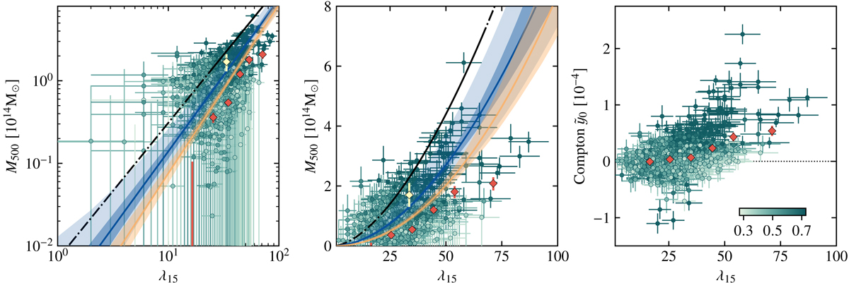
Mass-richness diagram displayed three ways. The left and center panels are respectively log-log and linear plots of ![]() converted to mass versus richness, while the right panel is a linear plot of unconverted
converted to mass versus richness, while the right panel is a linear plot of unconverted ![]() versus richness. On left and in the center, the best-fit scaling relation is shown as computed when including (blue) and excluding (yellow-orange) the weight parameter of Eq. (17) corresponding to noise-like data points. For each band, the solid line corresponds to the best-fit scaling, while the bands correspond to the 68% credible interval. The lighter blue band denotes the confidence interval σlnM|λ due to the intrinsic scatter around the mean scaling relation obtained when considering the mixed model of Eq. (17). The dot-dashed line denotes the scaling reported by Gonzalez et al. (2019a), with the solid section marking the range of richness employed to derive the relation. The green points correspond to the masses or
versus richness. On left and in the center, the best-fit scaling relation is shown as computed when including (blue) and excluding (yellow-orange) the weight parameter of Eq. (17) corresponding to noise-like data points. For each band, the solid line corresponds to the best-fit scaling, while the bands correspond to the 68% credible interval. The lighter blue band denotes the confidence interval σlnM|λ due to the intrinsic scatter around the mean scaling relation obtained when considering the mixed model of Eq. (17). The dot-dashed line denotes the scaling reported by Gonzalez et al. (2019a), with the solid section marking the range of richness employed to derive the relation. The green points correspond to the masses or ![]() values without any correction for the steepness of the halo mass function (Hilton et al. 2021). These are color coded according to their weight w (color bar in the bottom right corner of the right panel). In red are the masses or
values without any correction for the steepness of the halo mass function (Hilton et al. 2021). These are color coded according to their weight w (color bar in the bottom right corner of the right panel). In red are the masses or ![]() values computed per richness bin. For comparison, we include, as a yellow diamond, the average mass estimate computed by Madhavacheril et al. (2020) from CMB lensing, shown at the mean value of λ15 used in that work. We note that the left and center plots do not show the negative
values computed per richness bin. For comparison, we include, as a yellow diamond, the average mass estimate computed by Madhavacheril et al. (2020) from CMB lensing, shown at the mean value of λ15 used in that work. We note that the left and center plots do not show the negative ![]() points, but those points are included in all fits shown.
points, but those points are included in all fits shown.
Current usage metrics show cumulative count of Article Views (full-text article views including HTML views, PDF and ePub downloads, according to the available data) and Abstracts Views on Vision4Press platform.
Data correspond to usage on the plateform after 2015. The current usage metrics is available 48-96 hours after online publication and is updated daily on week days.
Initial download of the metrics may take a while.