Fig. 2
Download original image
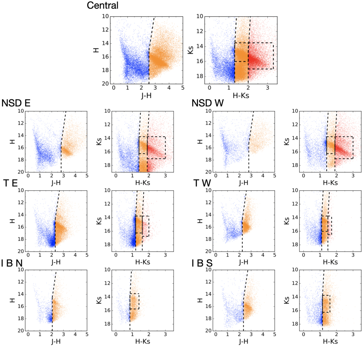
Colour-magnitude diagrams for each region of the GNS survey. The dashed lines represent the cuts applied in this work between the foreground population (in blue) and stars that we consider to lie inside the GC, behind two different layers of extinction (orange and red). The extinction layers were selected following the methodology explained in Sect. 3.2. The dashed rectangles indicate the selection of reference stars (mainly RC stars) to create the extinction maps. Only two layers are defined for the IBN and IBS regions. The low number of stars present for the NSD W region is due to the lower than average quality of the data for that region. Given the high number of stars, only a fraction of them is represented to not overcrowd the plots.
Current usage metrics show cumulative count of Article Views (full-text article views including HTML views, PDF and ePub downloads, according to the available data) and Abstracts Views on Vision4Press platform.
Data correspond to usage on the plateform after 2015. The current usage metrics is available 48-96 hours after online publication and is updated daily on week days.
Initial download of the metrics may take a while.