Fig. 14.
Download original image
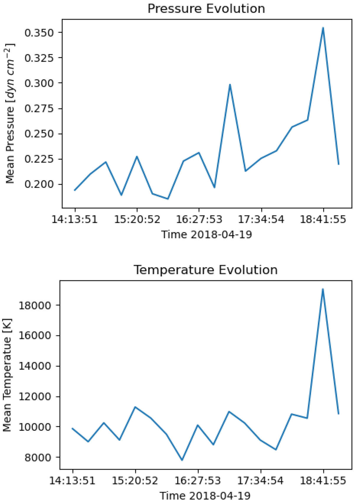
Temporal evolution of (top) mean pressure and (bottom) mean temperature. These plots only include the satisfactory matches. The large spike near the end is due to interference seen in half of the slit positions of that raster. This caused a lot of the previously lower temperature regions to be filtered out, and therefore only the higher temperature areas are included in the calculation of the mean. A similar (but less extreme) situation occurred where the second highest peak is seen in the plot of pressure; however, the mean temperature plot seems unaffected by this.
Current usage metrics show cumulative count of Article Views (full-text article views including HTML views, PDF and ePub downloads, according to the available data) and Abstracts Views on Vision4Press platform.
Data correspond to usage on the plateform after 2015. The current usage metrics is available 48-96 hours after online publication and is updated daily on week days.
Initial download of the metrics may take a while.