Fig. 8.
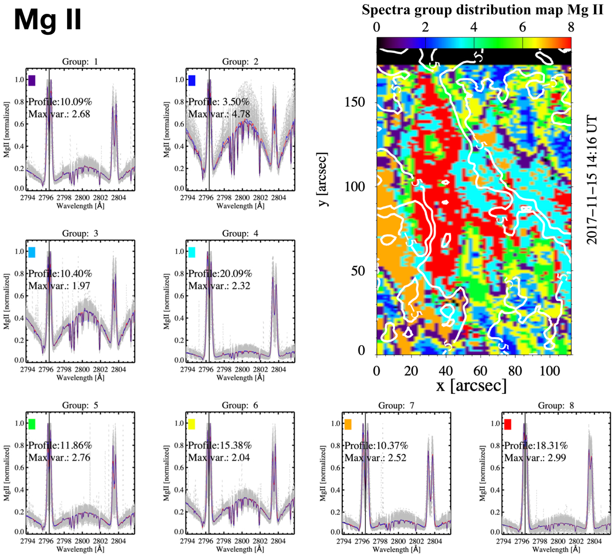
Classification of all Mg II spectra in the FOV into 8 groups using the k-means algorithm. The small panels show the most characteristics spectra classified into 8 groups. The blue line indicates the centroid of k-means, the blue-red line represents the average spectral line profile, and the grey lines show the variance of all profiles in the group. The colour of the rectangle in the spectra corresponds to the colour indicating the location of the spectrum in the distribution map (top right panel). The white contours of the distribution map outline the ±5 km s−1 plasma flow in Fe XII, thus indicating the position of the upflow region and the active region core.
Current usage metrics show cumulative count of Article Views (full-text article views including HTML views, PDF and ePub downloads, according to the available data) and Abstracts Views on Vision4Press platform.
Data correspond to usage on the plateform after 2015. The current usage metrics is available 48-96 hours after online publication and is updated daily on week days.
Initial download of the metrics may take a while.