Fig. 5.
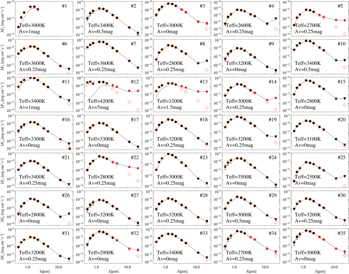
Spectral energy distribution for all the identified candidates. The grey line shows the observed photometry. The filled circles connected with a grey line correspond to the observed photometry corrected from the best-fit value of the extinction, where the black circles are those used for the fitting, and the red circles were ignored owing to excess emission at these wavelengths. The orange diamonds represent the best-fitting BT-Settl model.
Current usage metrics show cumulative count of Article Views (full-text article views including HTML views, PDF and ePub downloads, according to the available data) and Abstracts Views on Vision4Press platform.
Data correspond to usage on the plateform after 2015. The current usage metrics is available 48-96 hours after online publication and is updated daily on week days.
Initial download of the metrics may take a while.