Fig. 4.
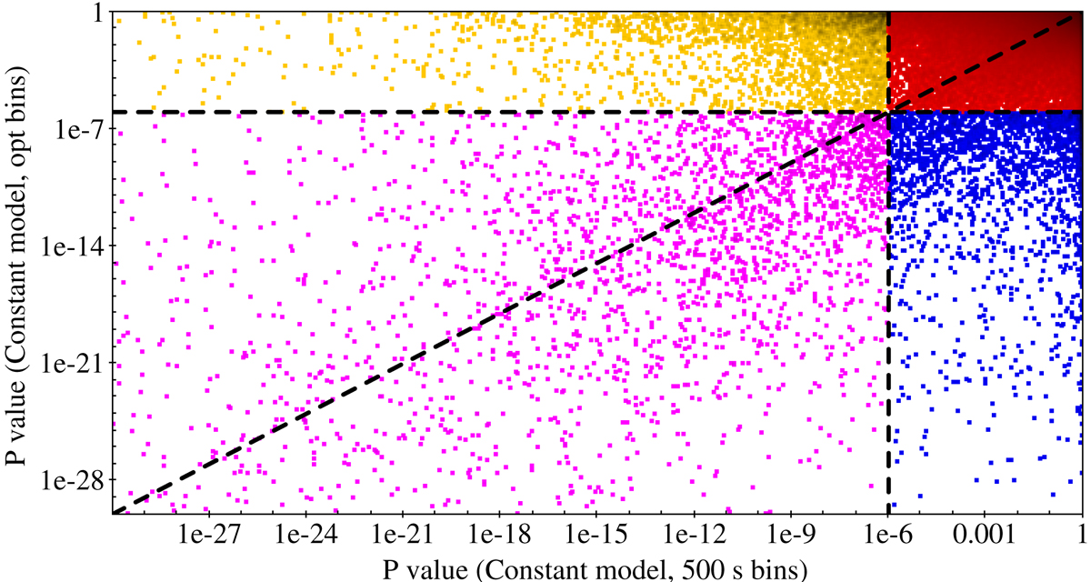
Distribution of the p-value for a constant model as applied to optimal bin and 500 s bin light curves for each source. The threshold lines at p-value = 10−6 divide the plot into four regions that are colour-coded as in Fig. 5. Yellow points (2789) in the top left corner correspond to sources whose optimal bin light curves are compatible with a constant, while 500 s light curves are not. Red points (787 023) in the top right corner correspond to sources whose light curves are compatible with a constant in both cases. Magenta points (2324) in the lower left corner correspond to sources whose light curves are not compatible with a constant in either case. Blue points (2257) in the lower right corner correspond to sources whose 500 s bin light curves are compatible with a constant, while optimal light curves are not. See also Fig. 5.
Current usage metrics show cumulative count of Article Views (full-text article views including HTML views, PDF and ePub downloads, according to the available data) and Abstracts Views on Vision4Press platform.
Data correspond to usage on the plateform after 2015. The current usage metrics is available 48-96 hours after online publication and is updated daily on week days.
Initial download of the metrics may take a while.