Fig. 15.
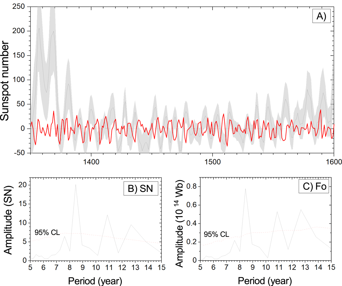
Reconstructed solar activity around the Spörer minimum. Panel A: the black curve with grey-shaded error bars represents the main reconstruction and is identical to that in Fig. 12, while the red curve depicts a reconstruction based on one realisation of the simulated noise series (see text). Panel B: FFT spectrum (amplitude) of the main SN reconstruction (shown in panel A) for the period 1400–1550, while the red dotted line depicts the upper 95th percentile of the FFT spectra of 1000 noise-based reconstructions for the same period (see text). Panel C: same as panel B, but for OSF.
Current usage metrics show cumulative count of Article Views (full-text article views including HTML views, PDF and ePub downloads, according to the available data) and Abstracts Views on Vision4Press platform.
Data correspond to usage on the plateform after 2015. The current usage metrics is available 48-96 hours after online publication and is updated daily on week days.
Initial download of the metrics may take a while.