Fig. 5
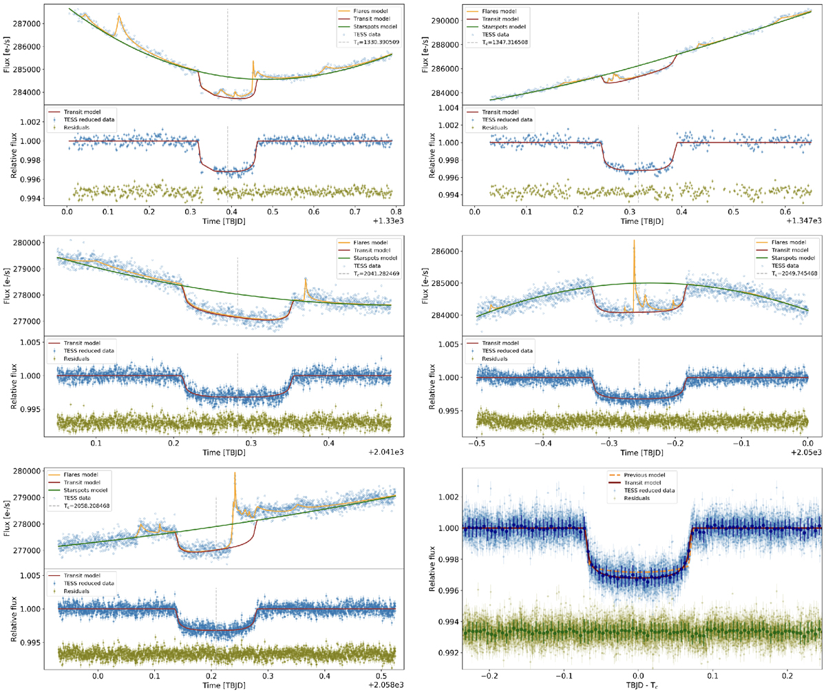
Each panel shows the range around one of the three transits of AU Mic b observed by TESS. The top part of each panel shows the TESS data (blue circles) and the best-fit model for each component, as indicated in the legend. The bottom partin each panel shows the TESS data normalized by the starspot and flare model (blue points) and the best-fit transit model (red line). Vertical dashed lines show the central time of each transit. Bottom right panel: phase-folded light curve for all the data from the five transits (light blue points) and the binned data (dark blue points) with a bin size of 0.005 d, our best fit model (red line), and the previous fit model of Plavchan et al. (2020) for comparison (orange dashed line). The residuals (green points) are displayed with an arbitrary offset.
Current usage metrics show cumulative count of Article Views (full-text article views including HTML views, PDF and ePub downloads, according to the available data) and Abstracts Views on Vision4Press platform.
Data correspond to usage on the plateform after 2015. The current usage metrics is available 48-96 hours after online publication and is updated daily on week days.
Initial download of the metrics may take a while.