Fig. 6
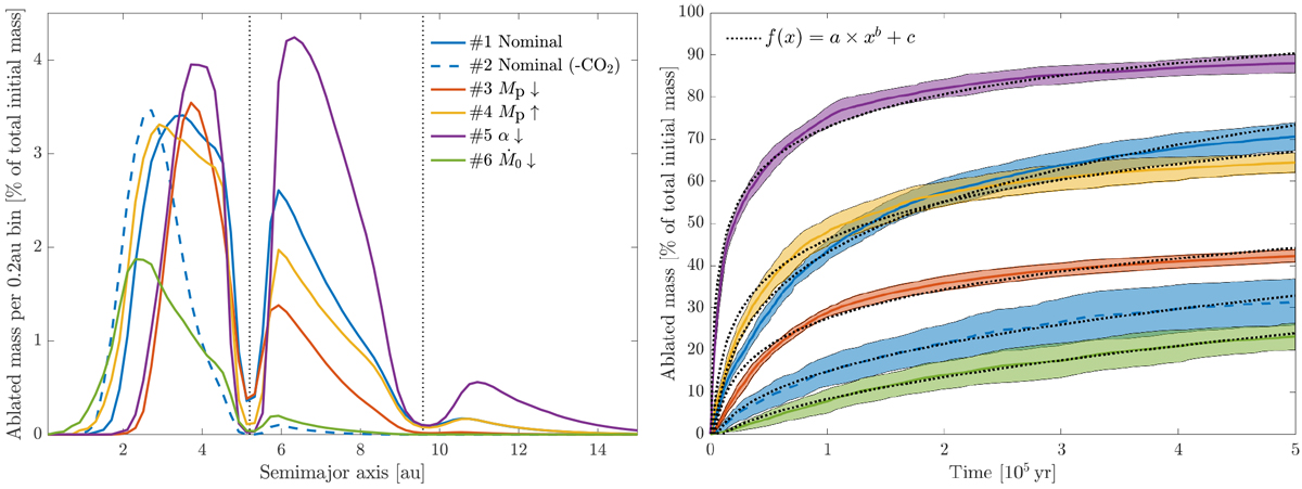
Distribution of ablated mass as a function of semimajor axis (left) and time (right) for all Solar System simulations. Left plot: Distribution of ablated mass across the disk after 500 kyr. The values on the y-axis represent the amount of mass that has been ablated in a 0.2 au semimajor axis bin. The dotted lines mark the semimajor axes of Jupiter and Saturn. Most mass loss occur in the region just interior to and exterior to Jupiter’s orbit. Right plot: Total amount of mass that has been ablated as a function of time, for the same data as in the left plot. The colored lines show the average over the ten simulations, and the colored region shows the one standard deviation away from this value. The dotted black lines show the best fit to the curve f(x); and the parameters to the fits can be found in Table 2. The mass ablation rate is highly dependent on the gas surface density, where a high surface density results in a high degree of ablation (#5) and a low surface density results in low degree of ablation (#6).
Current usage metrics show cumulative count of Article Views (full-text article views including HTML views, PDF and ePub downloads, according to the available data) and Abstracts Views on Vision4Press platform.
Data correspond to usage on the plateform after 2015. The current usage metrics is available 48-96 hours after online publication and is updated daily on week days.
Initial download of the metrics may take a while.