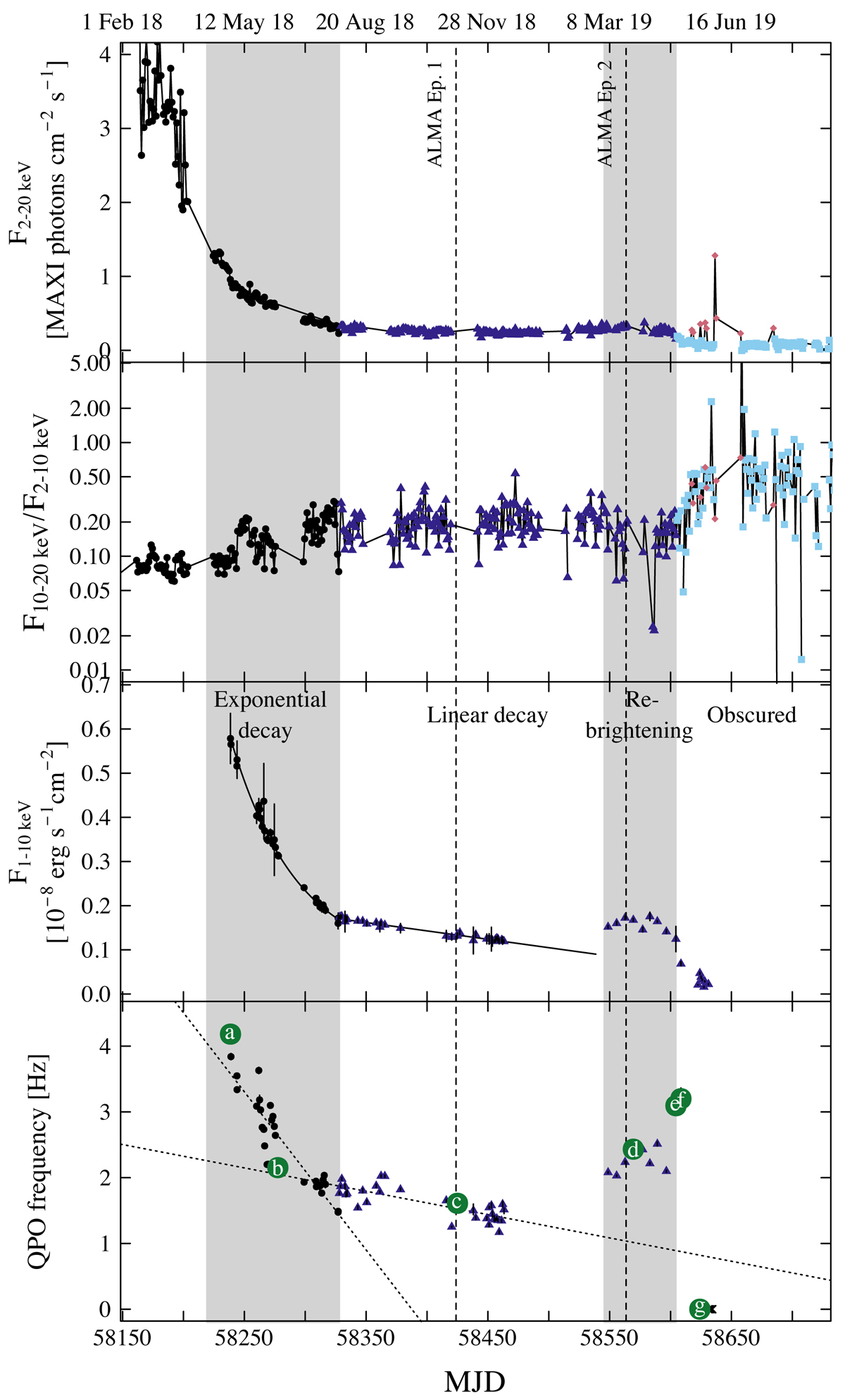
Fig. 1.
Top: MAXI/GSC 2–20 keV daily light curve of GRS 1915+105 since February 2018 with ALMA observations marked as dashed vertical lines. The data points are colored and marked according to the hardness-intensity diagram shown in Fig. 2. Middle/top: MAXI/GSC 10–20 keV/2–10 keV daily hardness ratio. Middle/bottom: NICER 1–10 keV light curve with flux densities estimated from spectral fitting and the light curve decay fitted with an exponential and a linear decay models (solid line). The different decay phases are indicated and shown as an alternating shading scheme. Bottom: QPO frequencies as determined from modeling the NICER PSD. The exponential and linear decay phases show different rates of decay for the QPO frequency (shown as dotted lines). The seven lettered observations correspond to example PSD and spectra shown in Figs. 3, 7, and 6.
Current usage metrics show cumulative count of Article Views (full-text article views including HTML views, PDF and ePub downloads, according to the available data) and Abstracts Views on Vision4Press platform.
Data correspond to usage on the plateform after 2015. The current usage metrics is available 48-96 hours after online publication and is updated daily on week days.
Initial download of the metrics may take a while.