Fig. 8
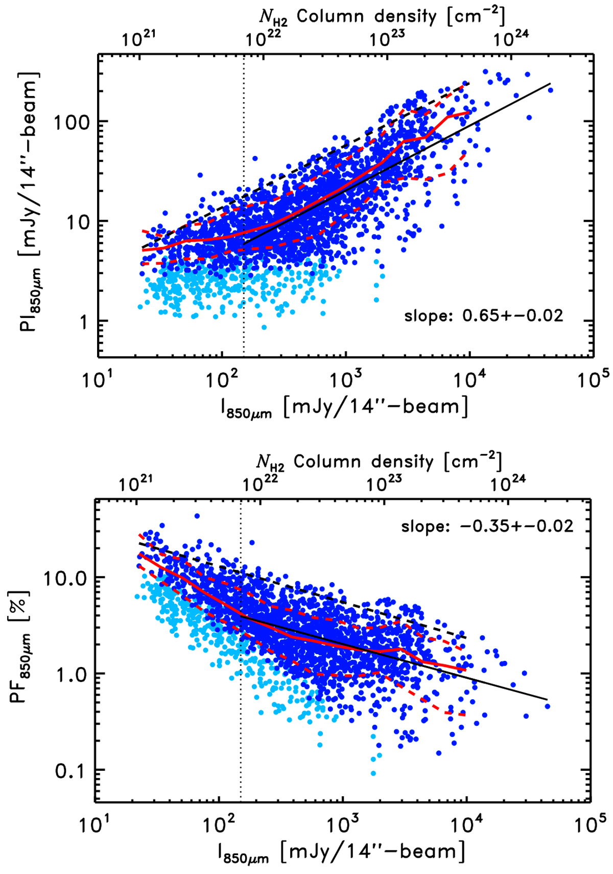
Top: PI versus I for SNR(I) > 25. The light and dark blue symbols are data points with 1 <SNR(PI) < 3 and SNR(PI) > 3, respectively. The dots correspond to 12′′ pixels. The red solid curve shows the median log(PI) per bin of log(I). The lower and the upper dashed red lines show the 16% and 84% percentiles, respectively. The black solid line is a linear fit to the distribution for SNR(PI) > 3 and I > 150 mJy beam−1 (indicated by the dotted vertical line). The value of the slope is given on the plot. The black dashed line is a linear fit to the upper 95% percentiles (see Sect. 3.3). The upper x-axis gives an estimate of the ![]() column density (see Sect. 2.3). Bottom: PF versus I. The dots, curves, and colors are the same as the upper plot for PF versus
I.
column density (see Sect. 2.3). Bottom: PF versus I. The dots, curves, and colors are the same as the upper plot for PF versus
I.
Current usage metrics show cumulative count of Article Views (full-text article views including HTML views, PDF and ePub downloads, according to the available data) and Abstracts Views on Vision4Press platform.
Data correspond to usage on the plateform after 2015. The current usage metrics is available 48-96 hours after online publication and is updated daily on week days.
Initial download of the metrics may take a while.