Fig. C.1
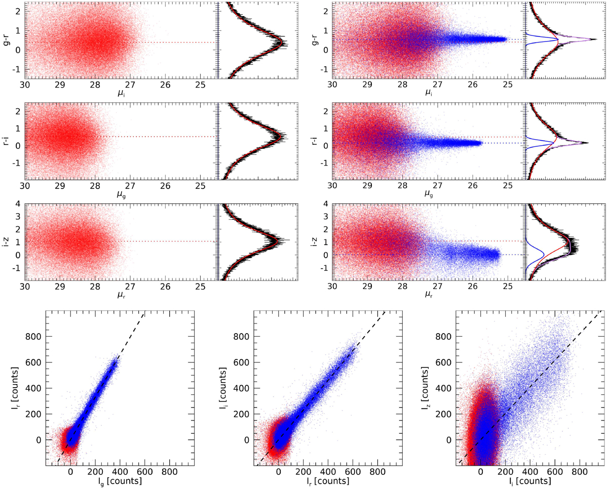
Color distribution of the noise in the Control Field and the resulting color distribution by adding an artificial constant color structure. Upper left panels: color vs. surface brightness values (red dots) of pixels dominated by the noise. Their color distribution is very well fitted by a Lorentzian function (red curve) as shown in the right side of the plot. Upper right panel: same but adding a constant color structure (blue dots) fitted by a Gaussian function (blue curve). The purple curve is the result of combining a Lorentzian plus a Gaussian function. The horizontal dashed lines correspond to the calculated centers of the Lorentzian and Gaussian functions. Bottom panels: correlation between the flux of the different bands. The dotted line corresponds to the best fit using a linear least-squares approximation in one-dimension.
Current usage metrics show cumulative count of Article Views (full-text article views including HTML views, PDF and ePub downloads, according to the available data) and Abstracts Views on Vision4Press platform.
Data correspond to usage on the plateform after 2015. The current usage metrics is available 48-96 hours after online publication and is updated daily on week days.
Initial download of the metrics may take a while.