Fig. 2.
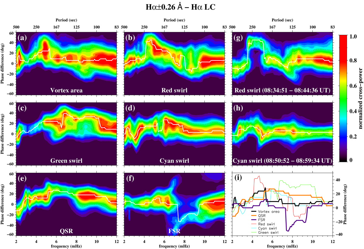
Phase differences between the Hα ± 0.26 Å and Hα LC pair within (a) the vortex flow area, the areas of swirls within the red, cyan, and green circles and the QSR and FSR areas depicted in Fig. 1 during the second observing time interval, i.e. 08:28 UT–09:16 UT (panels a–f) and (b) for the two swirls within the red and cyan circles for specific time intervals (denoted in the respective panels) when these swirls are clearly visible (panels g and h). Both wavelengths are mainly of chromospheric origin and their formation heights are separated by a few hundred kilometers (see Sect. 3). Filled contours represent the cross-power distribution, while white lines denote the position of maximum cross-power, normalised to unity for each frequency element as shown by the vertical bar. The black dashed contour indicates the 50% level from maximum cross-power, and provides a measure of the scatter as it represents the FWHM of the cross-power distribution at each frequency. Cross-power below 10% has been disregarded while all curves have been smoothed with a running average of seven frequency points to remove spurious spikes. The corresponding phase difference of the normalised-to-unity maximum-cross power as a function of frequency, within all considered areas and for the entire considered observing interval only, is also shown in a separate panel (panel i) for an easier and direct comparison.
Current usage metrics show cumulative count of Article Views (full-text article views including HTML views, PDF and ePub downloads, according to the available data) and Abstracts Views on Vision4Press platform.
Data correspond to usage on the plateform after 2015. The current usage metrics is available 48-96 hours after online publication and is updated daily on week days.
Initial download of the metrics may take a while.