Fig. 3.
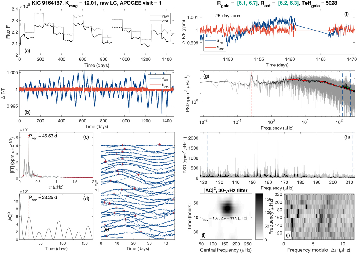
Data inspection tool applied to the RGB star KIC 9164187, which shows surface activity and oscillations, including mixed dipole modes. Left column from top to bottom. Panel a: Kepler light curves as a function of time, where “raw” stands for SAP and “cor” for PDCSAP. Panel b: light curves expressed in relative fluxes ΔF/F, where the blue line contains the stellar activity and oscillations, and the red curve is optimized for oscillation search (activity filtered out). Panel c: fourier spectrum of the time series, where the highest peak and its corresponding period is indicated in days. Panel d: square of the autocorrelation |AC|2 of the time series, where the highest correlation is indicated and expressed in days. Panel e: light curve folded on the dominant variability period, where a vertical shift between consecutive multiples of the rotational period was introduced. Right column from top to bottom. Panel f: zoom of the light curve over 25 days. Panel g: log-log scale display of the power spectral density of the time series (gray line) expressed in ppm2 μHz−1 as a function of frequency (μHz). The black line is a smooth of it (boxcar) over 100 points. The solar-like oscillations appear as an excess power between the two dashed blue lines. The plain red line represents the model of the stellar background noise and the green line is the Gaussian function used to model the oscillation power. The vertical dashed line indicates the peak corresponding to the rotational modulation determined in panel c. Panel h: power density spectrum of the time series as a function of frequency centered around νmax (here ≈162 μHz). Panel i: envelope of the autocorrelation function (EACF) as a function of frequency and time. The dark area corresponds to the correlated signal – i.e., the oscillations – where its abscissa indicates νmax and its ordinate 2/Δν. Panel j: échelle diagram associated with the large frequency spacing automatically determined from the EACF plot. The power density spectrum is smoothed by a boxcar over three bins and cut into Δν = 11.9 μHz chunks; each is then stacked on top of its lower-frequency neighbor. This representation allows for visual identification of the modes. Darker regions correspond to larger peaks in power density. The x-axis is the frequency modulo the large frequency spacing (i.e., from 0 to Δν), and the y-axis is the frequency.
Current usage metrics show cumulative count of Article Views (full-text article views including HTML views, PDF and ePub downloads, according to the available data) and Abstracts Views on Vision4Press platform.
Data correspond to usage on the plateform after 2015. The current usage metrics is available 48-96 hours after online publication and is updated daily on week days.
Initial download of the metrics may take a while.