Fig. 2
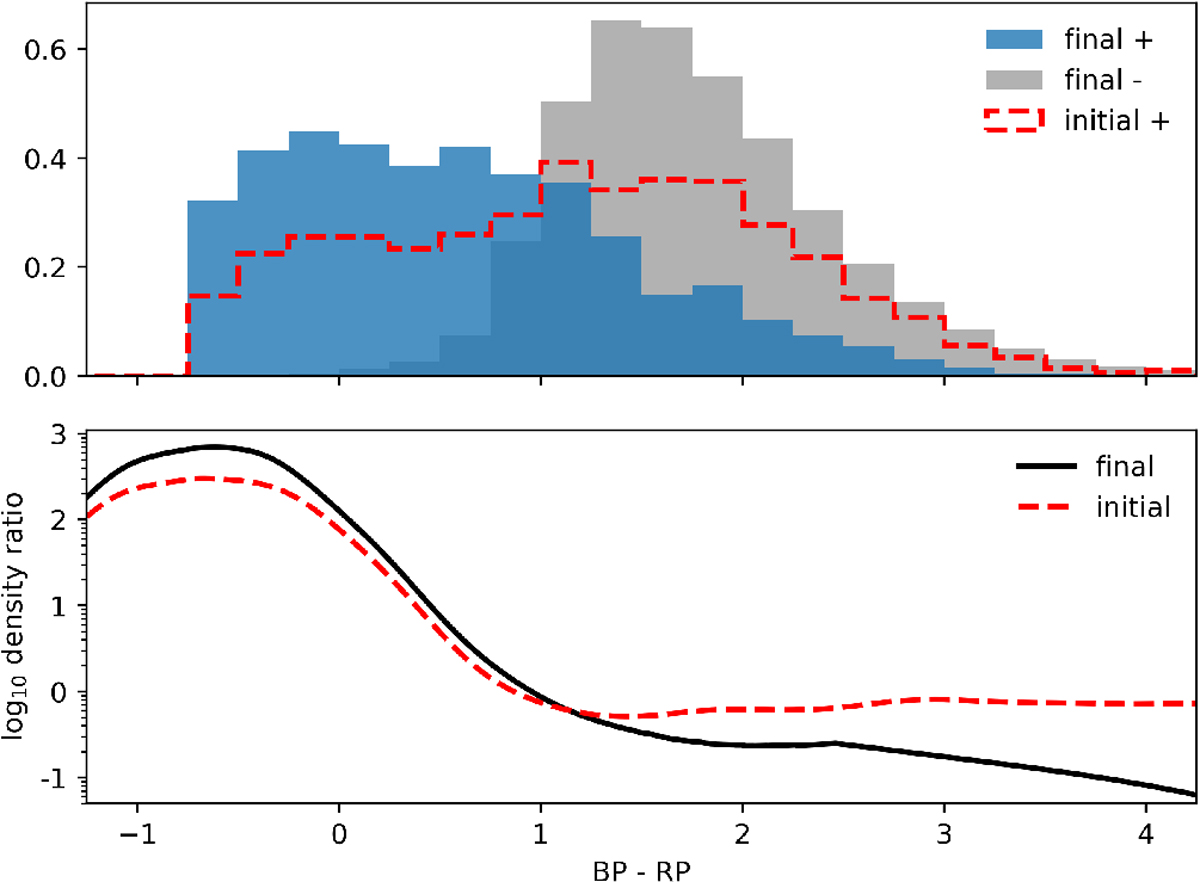
Histogram of BP – RP colours for three different sets of Gaia sources covering both iterations of the colour density ratio computation. The grey histogram shows the distribution of colours of background sources, which does not change visibly between iterations. The initial colour distribution derived from nearest neighbouring sources is indicated by the red dashed line. The colour distribution of the final selection based on separation is indicated in blue. Lower panel: density ratio in colour space, also for both iterations, with the final density ratio indicated by the black line, and the initial ratio derived from nearest versus non-nearest neighbours shown by the dashed red line. All densities are for sources with a well-behaved BP/RP excess factor (indicating reliable colour measurements).
Current usage metrics show cumulative count of Article Views (full-text article views including HTML views, PDF and ePub downloads, according to the available data) and Abstracts Views on Vision4Press platform.
Data correspond to usage on the plateform after 2015. The current usage metrics is available 48-96 hours after online publication and is updated daily on week days.
Initial download of the metrics may take a while.