Fig. 18
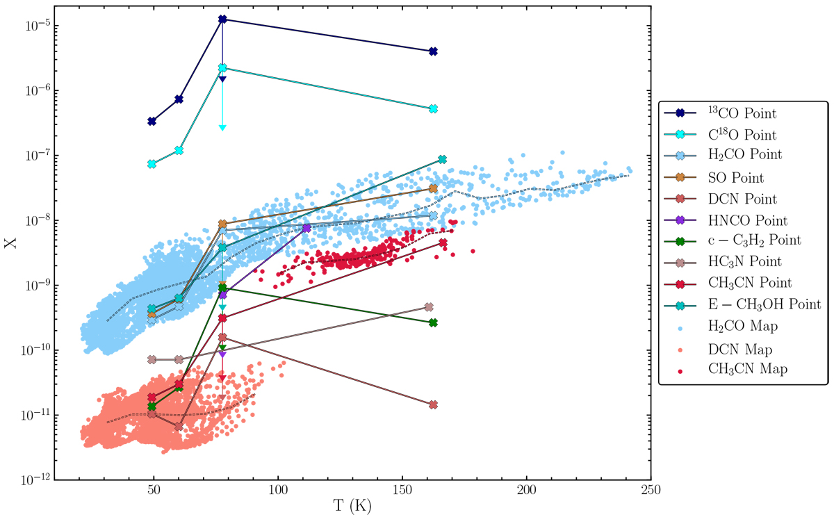
Abundance vs. temperature from the maps shown in Fig. 17 (dots) and the fits to the WideX spectra discussed in Sect. 4.2 (connected crosses). The different colours denote different species (see legend), using the same colours as in Fig. 16. The dashed lines indicate a rolling median of map points within ± 10 K, measured every 10 K as long as at least 10 points are included. The downward vertical arrows show the effect of increasing N[H2] at the outflow position (which is likely underestimated, leading to the molecular abundances being overestimated) such that the 12C/13C ratio would be 76. The uncertainty in the abundances is conservatively estimated to be around a factor of two (see text for details).
Current usage metrics show cumulative count of Article Views (full-text article views including HTML views, PDF and ePub downloads, according to the available data) and Abstracts Views on Vision4Press platform.
Data correspond to usage on the plateform after 2015. The current usage metrics is available 48-96 hours after online publication and is updated daily on week days.
Initial download of the metrics may take a while.