Fig. 2.
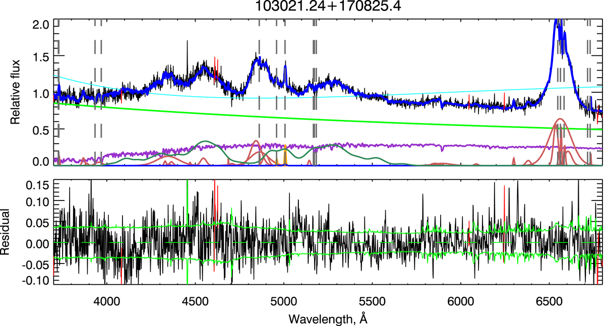
Example of the spectra with strong FeII emission. In the upper panel, the black line represents the observed spectrum, the blue line represents the best fit model, and the cyan line represents the multiplicative polynomial, while the green, light red, and violet lines represent components of the ULySS best fit model as follows: violet is the stellar population, red corresponds to the emission lines, and green is the AGN continuum. Grey vertical lines mark the wavelengths in the air of the next lines as follows: [OII]3727.5, CaII H & K, Hβ narrow component, [OIII]λλ4959,5007 narrow components and MgI b lines, narrow components of Hα, [NII]λλ46548,6583, and [SII]λλ46716,6731, respectively. Residuals from the best fit (black line) are shown on the bottom panel. The dashed line is the zero-axis, and the green solid line shows the level of the noise. Red lines in both panels correspond to outliers of the fit.
Current usage metrics show cumulative count of Article Views (full-text article views including HTML views, PDF and ePub downloads, according to the available data) and Abstracts Views on Vision4Press platform.
Data correspond to usage on the plateform after 2015. The current usage metrics is available 48-96 hours after online publication and is updated daily on week days.
Initial download of the metrics may take a while.