Fig. 5
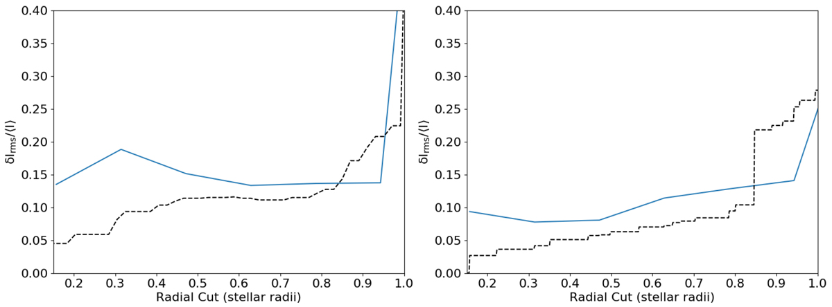
Contrast of the data set as a function of the radial cut considered. The black dashed line indicates the contrast of the SQUEEZE reconstructed image (2016 in the left panel and 2019 in the right panel) and the blue solid line is one of the best simulated snapshot for each data set (snapshot 65 for 2016 data and snapshot 67 for 2019 data).
Current usage metrics show cumulative count of Article Views (full-text article views including HTML views, PDF and ePub downloads, according to the available data) and Abstracts Views on Vision4Press platform.
Data correspond to usage on the plateform after 2015. The current usage metrics is available 48-96 hours after online publication and is updated daily on week days.
Initial download of the metrics may take a while.