Fig. 3.
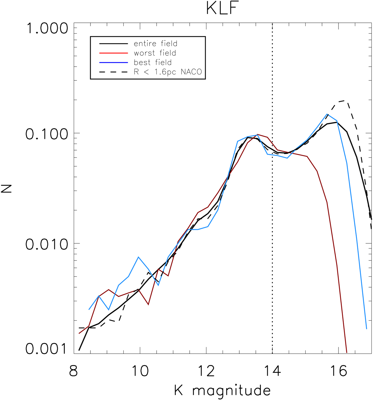
Comparison between the KLFs determined from the entire field (black line) and those from the worst field (red line), the best field (blue line), and NACO data (dashed line). The KLFs are computed after correcting the magnitude of each star using the extinction map of Dong et al. (2011) and applying Mask 3. The dotted straight line indicates the faintest magnitude down to which the counts can be assumed complete for all fields.
Current usage metrics show cumulative count of Article Views (full-text article views including HTML views, PDF and ePub downloads, according to the available data) and Abstracts Views on Vision4Press platform.
Data correspond to usage on the plateform after 2015. The current usage metrics is available 48-96 hours after online publication and is updated daily on week days.
Initial download of the metrics may take a while.