Free Access
Fig. 4.
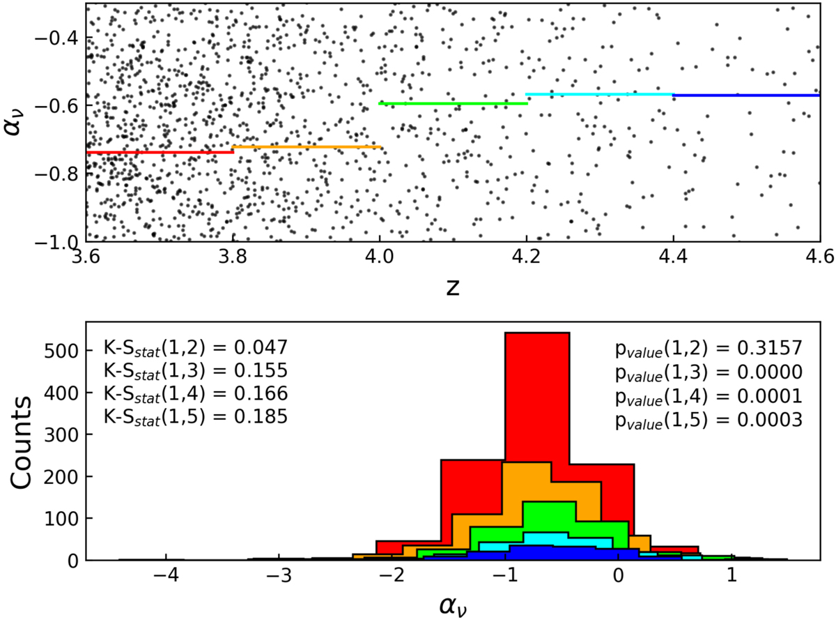
Upper panel: spectral slope as a function of redshift. The horizontal red, orange, green, cyan, and blue lines are the average values from the lowest to the highest redshift bins. Bottom panel: distribution of the spectral slope in each redshift bin (with the same color as in the upper panel).
Current usage metrics show cumulative count of Article Views (full-text article views including HTML views, PDF and ePub downloads, according to the available data) and Abstracts Views on Vision4Press platform.
Data correspond to usage on the plateform after 2015. The current usage metrics is available 48-96 hours after online publication and is updated daily on week days.
Initial download of the metrics may take a while.