Fig. 2.
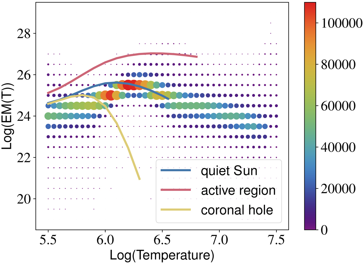
Histogram of the EM(T) values in the first region of interest (black square) of Fig. 1. The colour scale and the size of the points correspond to the number of pixels containing an EM of a given value at a given temperature. We have also traced in full lines the typical EMs from CHIANTI that we use to optimise the cost function (Eq. (21)). The red line corresponds to an active region, the blue line to the quiet Sun and the yellow line to a coronal hole.
Current usage metrics show cumulative count of Article Views (full-text article views including HTML views, PDF and ePub downloads, according to the available data) and Abstracts Views on Vision4Press platform.
Data correspond to usage on the plateform after 2015. The current usage metrics is available 48-96 hours after online publication and is updated daily on week days.
Initial download of the metrics may take a while.