Fig. 5.
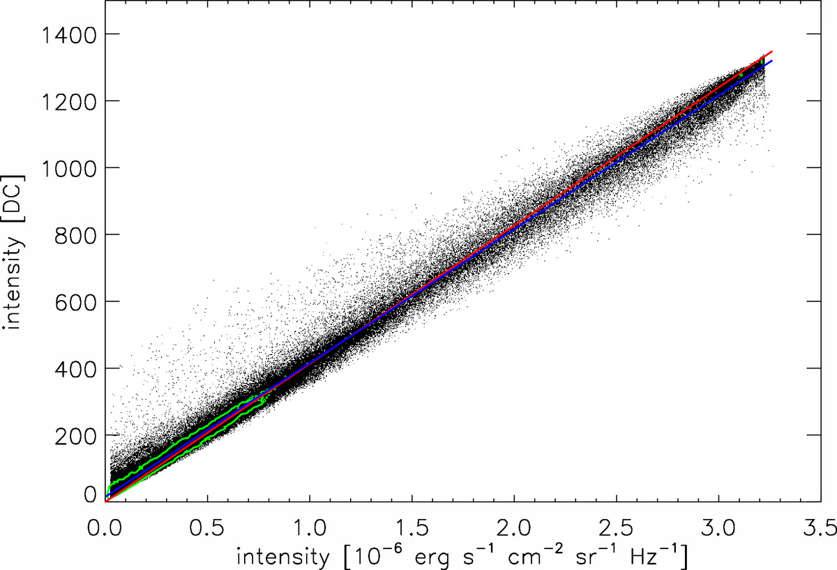
Scatter-plot showing a pixel-by-pixel comparison between intensities in the Hα line-center images (x-axis) and the SOT-like images (y-axis). Data from both GM and GDASH models are combined and pixels with very weak signal are excluded. The red line represents the Hα line-center intensity values converted into DC units. The blue line indicates a linear fit to the plotted data-points. The green contour marks the peak of the probability density function of the displayed data-points and encompasses an area containing 60% of all data-points.
Current usage metrics show cumulative count of Article Views (full-text article views including HTML views, PDF and ePub downloads, according to the available data) and Abstracts Views on Vision4Press platform.
Data correspond to usage on the plateform after 2015. The current usage metrics is available 48-96 hours after online publication and is updated daily on week days.
Initial download of the metrics may take a while.