Fig. 13.
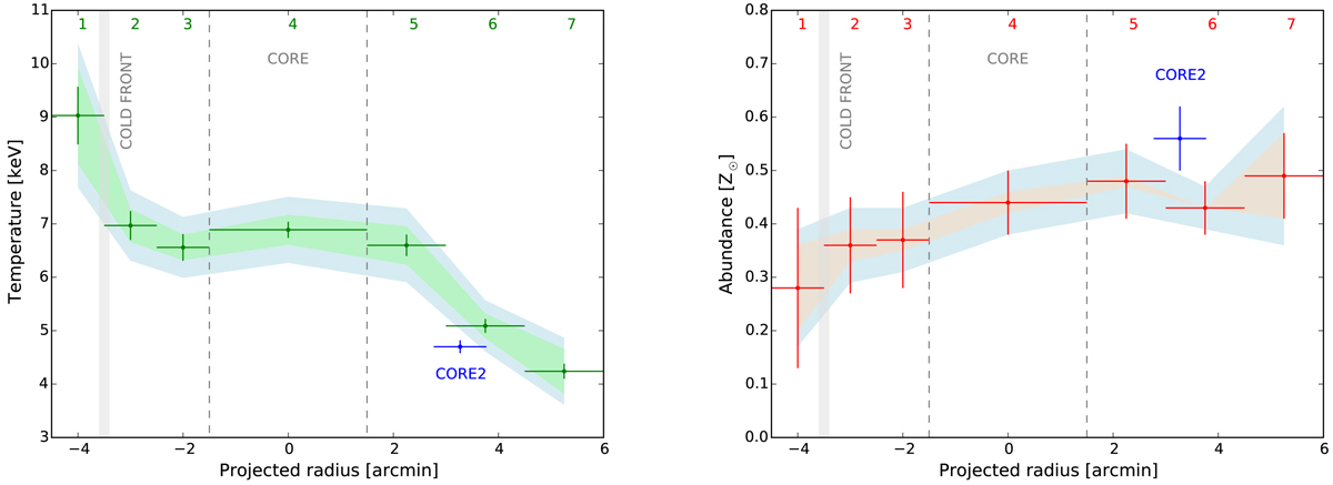
Left panel: temperature distribution along the merging axis of A2256. Right panel: abundance distribution along the merging axis of A2256. The shaded area represent the systematic uncertainties: green and orange shadows correspond to the background normalisation variation, and the blue one to the temperature structure. The shaded grey area shows the cold front position. The dashed lines show the outer edges of the core spectral extraction region. The numbers and CORE2 blue point correspond to the regions and the red circle centred on CORE2, respectively shown in Fig. 12.
Current usage metrics show cumulative count of Article Views (full-text article views including HTML views, PDF and ePub downloads, according to the available data) and Abstracts Views on Vision4Press platform.
Data correspond to usage on the plateform after 2015. The current usage metrics is available 48-96 hours after online publication and is updated daily on week days.
Initial download of the metrics may take a while.