Fig. 12
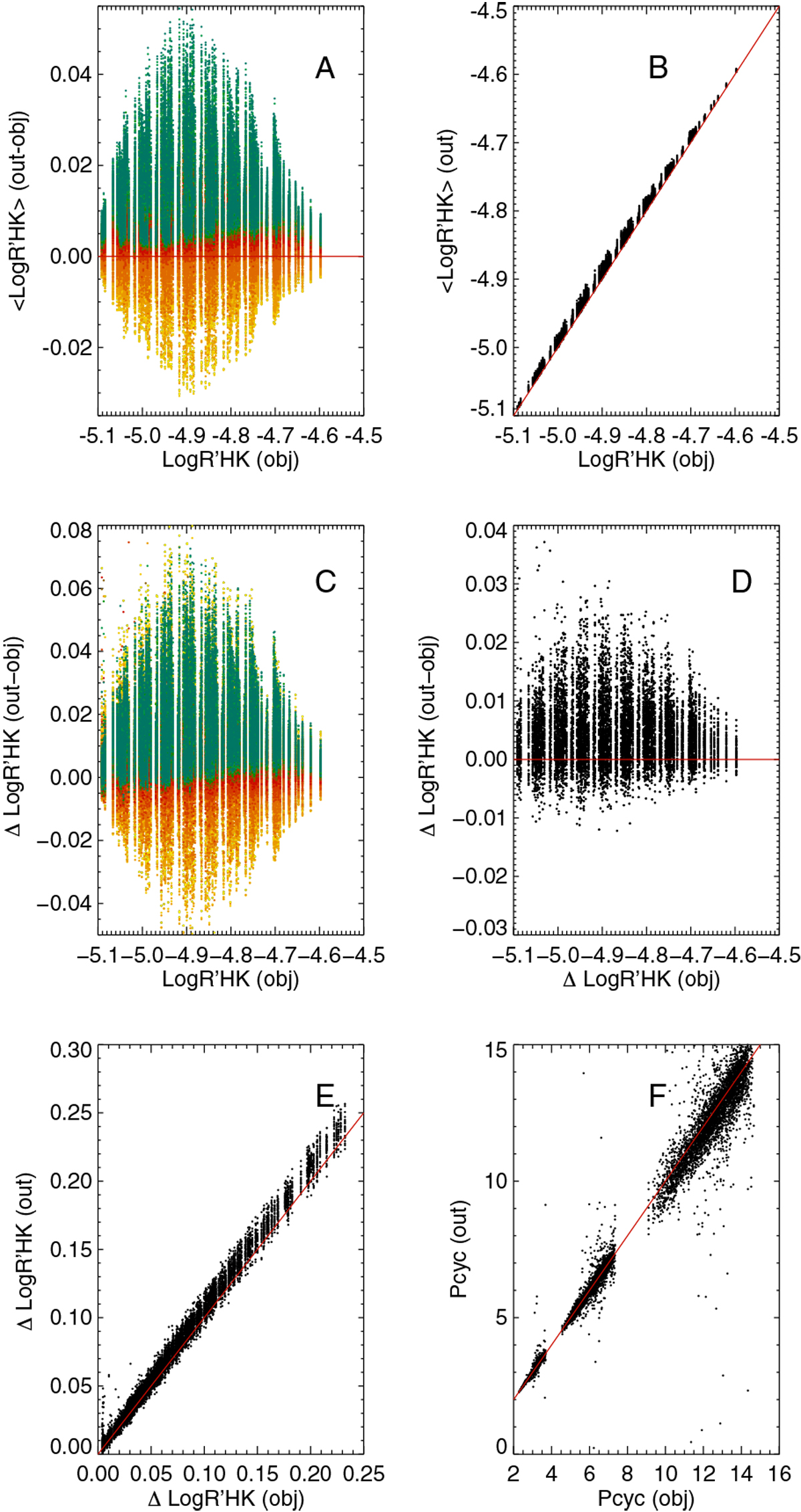
Panel A: Log ![]() –Log
–Log ![]() vs. Log
vs. Log ![]() for all simulations. The color indicates stellar inclination from 0°
(pole-on, yellow) to 90°
(edge-on, blue). Panel B: Log
for all simulations. The color indicates stellar inclination from 0°
(pole-on, yellow) to 90°
(edge-on, blue). Panel B: Log ![]() averaged over all inclinations vs. Log
averaged over all inclinations vs. Log ![]() . The solid red line indicates the y = x
linear function. Panel C: ΔLog
. The solid red line indicates the y = x
linear function. Panel C: ΔLog ![]() –ΔLog
–ΔLog ![]() vs. Log
vs. Log ![]() , where Δ
represents the amplitude of the cycle, for different inclinations (the color code is similar to panel A). Panel D:
ΔLog
, where Δ
represents the amplitude of the cycle, for different inclinations (the color code is similar to panel A). Panel D:
ΔLog ![]() –ΔLog
–ΔLog ![]() vs. Log
vs. Log ![]() , where Δ
representsthe amplitude of the cycle, after averaging the simulations made for inclination of 40°
and 50°.
Panel E: ΔLog
, where Δ
representsthe amplitude of the cycle, after averaging the simulations made for inclination of 40°
and 50°.
Panel E: ΔLog ![]() vs. ΔLog
vs. ΔLog ![]() , after averaging for inclination of 40°
and 50°. The solid red line indicates the y = x
linear function. Panel F: cycle period (in years) derived from a fit on smoothed Log
, after averaging for inclination of 40°
and 50°. The solid red line indicates the y = x
linear function. Panel F: cycle period (in years) derived from a fit on smoothed Log ![]() time series vs. the prescribed cycle period.
time series vs. the prescribed cycle period.
Current usage metrics show cumulative count of Article Views (full-text article views including HTML views, PDF and ePub downloads, according to the available data) and Abstracts Views on Vision4Press platform.
Data correspond to usage on the plateform after 2015. The current usage metrics is available 48-96 hours after online publication and is updated daily on week days.
Initial download of the metrics may take a while.