Fig. 2.
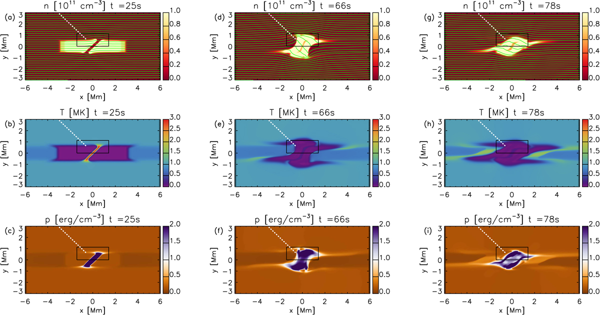
Maps of number density, temperature T, and gas pressure p at different times of the MHD simulation. In the ρ maps, green lines are magnetic field lines drawn from the left-hand boundary. The rectangular box shows the region over which we average quantities for Fig. 3, and the white dashed line is the cut we use to plot the time-distance diagram in Fig. 4. A movie is available online.
Current usage metrics show cumulative count of Article Views (full-text article views including HTML views, PDF and ePub downloads, according to the available data) and Abstracts Views on Vision4Press platform.
Data correspond to usage on the plateform after 2015. The current usage metrics is available 48-96 hours after online publication and is updated daily on week days.
Initial download of the metrics may take a while.