Fig. 9
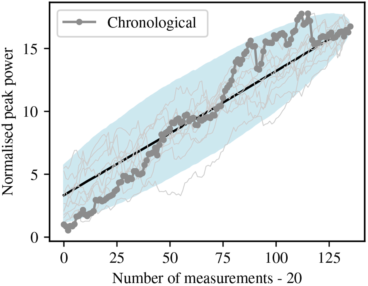
Evolution of the normalised power of the periodogram peak around the planetary candidate period. The GLS periodogram is normalised assuming Gaussian noise remains after removing the signal (Eq. (22) in Zechmeister & Kürster 2009). The grey curve and points correspond to the case where the measurements are added chronologically, while the light blue shaded area encompasses the range between the 5th- and 95th-percentile of the distribution obtained when the data are included in random order. The black curve is the mean of the distribution, and the thin curves are ten draws from the distribution.
Current usage metrics show cumulative count of Article Views (full-text article views including HTML views, PDF and ePub downloads, according to the available data) and Abstracts Views on Vision4Press platform.
Data correspond to usage on the plateform after 2015. The current usage metrics is available 48-96 hours after online publication and is updated daily on week days.
Initial download of the metrics may take a while.