Fig. 5
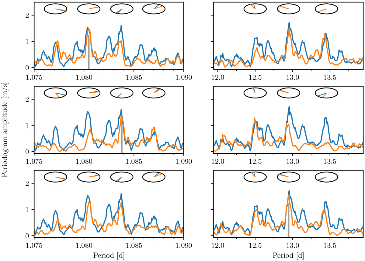
Aliases evaluation. Peak amplitudes and phases in two regions of period space related by daily aliases (left and right columns). Each row contains simulations assuming a given sinusoid period (marked as a grey vertical line in each row) is present in the data. The dials on top of selected peaks indicate the phase at that period. The orange curves and dials correspond to the simulations, while the blue curves and dials are the periodograms computed on the real data, and are identical in all three rows. The simulated data containing a sinusoid at 1.084-day period does not reproduce the amplitudes of the peaks at 1.0805 and 12.95 day. This period is therefore discarded.
Current usage metrics show cumulative count of Article Views (full-text article views including HTML views, PDF and ePub downloads, according to the available data) and Abstracts Views on Vision4Press platform.
Data correspond to usage on the plateform after 2015. The current usage metrics is available 48-96 hours after online publication and is updated daily on week days.
Initial download of the metrics may take a while.