Free Access
Fig. 12
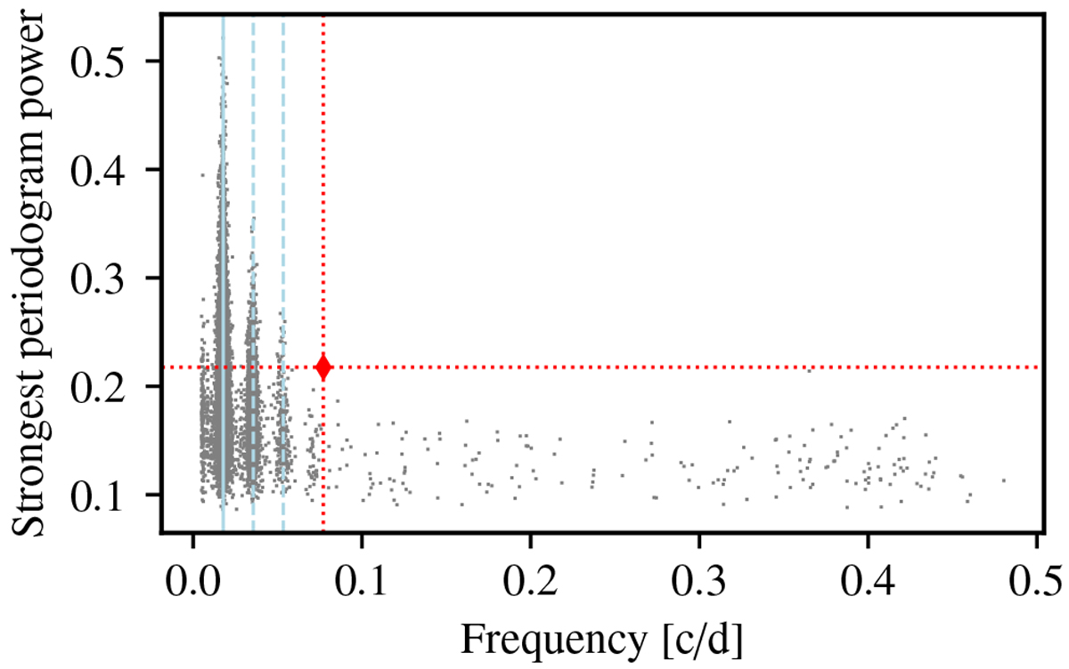
Distribution of the power and frequency of the largest periodogram peaks for 10 000 datasets simulated including only correlated noise. The rotational period and its two first harmonics are indicated by light blue solid and dashed lines, respectively. The red diamond represents the largest peak observed in the real dataset.
Current usage metrics show cumulative count of Article Views (full-text article views including HTML views, PDF and ePub downloads, according to the available data) and Abstracts Views on Vision4Press platform.
Data correspond to usage on the plateform after 2015. The current usage metrics is available 48-96 hours after online publication and is updated daily on week days.
Initial download of the metrics may take a while.