Fig. 11
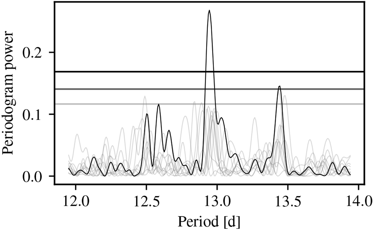
Comparison of the actual GLS periodogram of SOPHIE data (dark curve) and the periodograms obtained from simulated data sets not including a signal at that period. The ten periodograms exhibiting the strongest power at the vicinity of the detected signal among the 10 000 simulated cases are plotted in light grey. The horizontal lines are the 0.5, 0.1 and 0.01 p-value levels, computed as for Fig. 4.
Current usage metrics show cumulative count of Article Views (full-text article views including HTML views, PDF and ePub downloads, according to the available data) and Abstracts Views on Vision4Press platform.
Data correspond to usage on the plateform after 2015. The current usage metrics is available 48-96 hours after online publication and is updated daily on week days.
Initial download of the metrics may take a while.