Fig. 3.
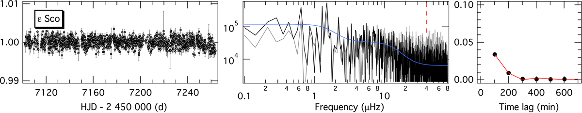
Left panel: relative instrumental flux of the approximately 161-day-long UBr binned data set of ε Sco. Middle panel: power density spectrum (in ppm2/μHz) of the binned (grey lines) and interpolated time series (black lines) along with a best global model fit (blue lines) and expected νmax (vertical red lines). Right panel: squared autocorrelation function of the binned time series (black dots) and a best fit (red line).
Current usage metrics show cumulative count of Article Views (full-text article views including HTML views, PDF and ePub downloads, according to the available data) and Abstracts Views on Vision4Press platform.
Data correspond to usage on the plateform after 2015. The current usage metrics is available 48-96 hours after online publication and is updated daily on week days.
Initial download of the metrics may take a while.