Fig. A.1
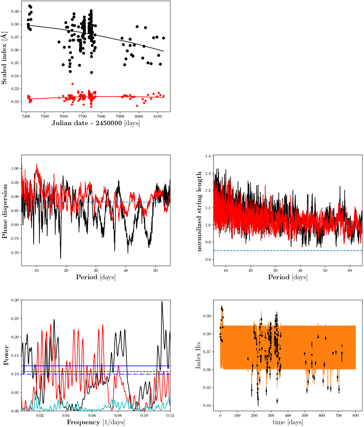
Results for GX And. Top left panel: index time series in black dots for IH α and in red asterisks for scaled ICa,1. The corresponding solid lines represent the best second-degree polynomial fit. Top right panel: phase folded index time series of IHα (only present in case we found a period using Hα). Second row left panel: phase dispersion minimisation. The black line denotes Θ computed for IHα, while the redline denotes Θ for ICa,1. The dashed horizontal line marks the 1% FAP level. Second row right panel: string length method. Again, the black line denotes the string length L for IH α and the red line is also the string length but computed for ICa,1. Third row left panel: GLS periodogram with FAP levels of 10, 5, and 1% in blue (dash-dotted, dashed, and solid), respectively. In the periodogram the black line denotes the normalised power calculated with IH α, while the redline again is the power of ICa,1, and thecyan line the window function. Third row right panel: index time series of the Hα indices with the GP best-fit model in orange and its standard deviation shaded in light orange.
Current usage metrics show cumulative count of Article Views (full-text article views including HTML views, PDF and ePub downloads, according to the available data) and Abstracts Views on Vision4Press platform.
Data correspond to usage on the plateform after 2015. The current usage metrics is available 48-96 hours after online publication and is updated daily on week days.
Initial download of the metrics may take a while.