Fig. 4.
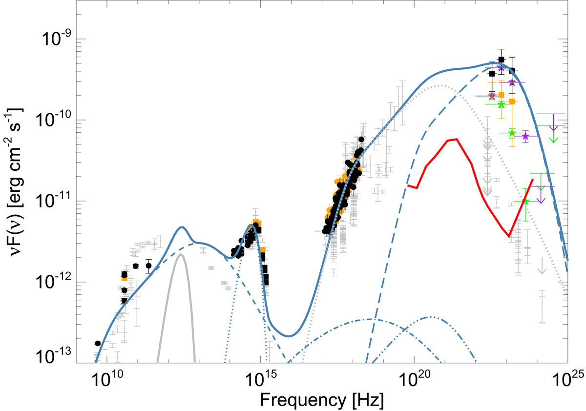
Spectral energy distribution for the two flares (time intervals from Fig. 3). Orange symbols refer to the AGILE data first flare and black symbols to the second, while green and purple symbols refer to the Fermi first and second flare, respectively. Small grey points are archival data. The blue lines represent the overall F2 SED fit (solid line) and each component, namely the synchrotron emission (dashed line), the black-body approximation to the disc emission (dotted line), the synchrotron self-Compton emission (SSC, dash-dotted line), the external Compton emission off the disc (dash-triple-dot line), and the external Compton emission off the broad-line region (long-dashed line). The light grey solid and dotted lines represent the torus and the external Compton emission off the torus photons, respectively. The red curve represents the e-ASTROGAM sensitivity for an integration time of 6 days (comparable to the AGILE and Fermi integration time for the spectral analysis).
Current usage metrics show cumulative count of Article Views (full-text article views including HTML views, PDF and ePub downloads, according to the available data) and Abstracts Views on Vision4Press platform.
Data correspond to usage on the plateform after 2015. The current usage metrics is available 48-96 hours after online publication and is updated daily on week days.
Initial download of the metrics may take a while.