Fig. 5.
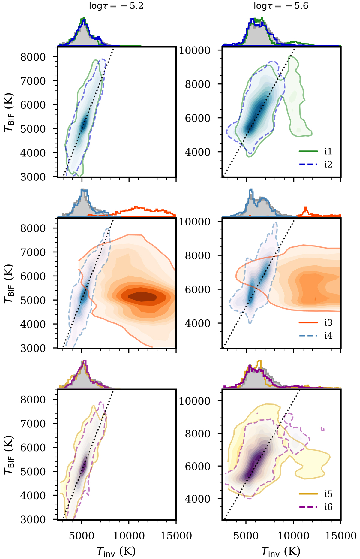
Joint probability densities of the temperature in the Bifrost simulation and inverted temperatures at two different optical depths. Each panel compares two inversion schemes (color code as in Fig. 4), and the dashed and solid lines enclose 90% of the distributions. The side plots show the corresponding histograms: top row: i1 vs i2, middle: i3 vs i4, and bottom: i5 vs. i6. The black dotted lines are the TBIF = Tinv locus.
Current usage metrics show cumulative count of Article Views (full-text article views including HTML views, PDF and ePub downloads, according to the available data) and Abstracts Views on Vision4Press platform.
Data correspond to usage on the plateform after 2015. The current usage metrics is available 48-96 hours after online publication and is updated daily on week days.
Initial download of the metrics may take a while.