Fig. 3.
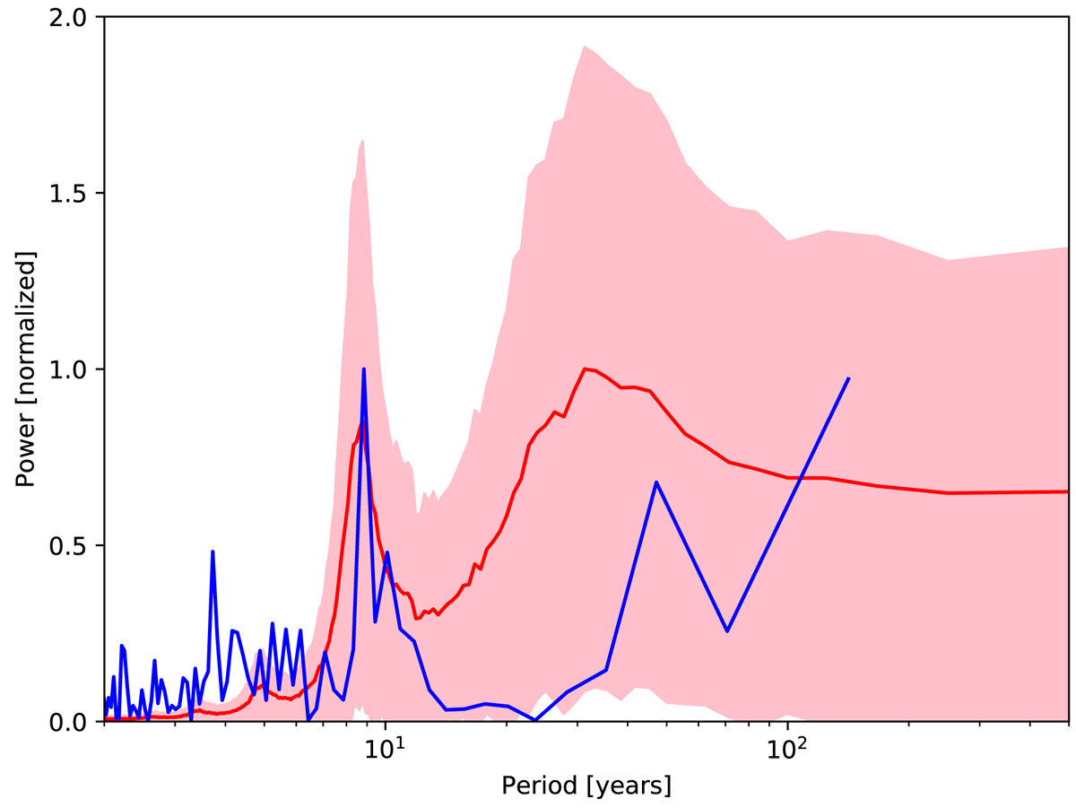
Power spectra of the absolute hemispheric asymmetry. The blue curve corresponds to the absolute asymmetry of the sunspot areas from the Greenwich/SOON data. The red curve gives the average power spectrum for the difference of the unsigned toroidal fluxes integrated between the equator and ±30/40° latitude). The latter is based on 1000 realizations of 500 year each from the Babcock–Leighton model with source fluctuations (Cameron & Schüssler 2017b). The pink shading indicates ±1 standard deviation from the mean.
Current usage metrics show cumulative count of Article Views (full-text article views including HTML views, PDF and ePub downloads, according to the available data) and Abstracts Views on Vision4Press platform.
Data correspond to usage on the plateform after 2015. The current usage metrics is available 48-96 hours after online publication and is updated daily on week days.
Initial download of the metrics may take a while.