Fig. 4.
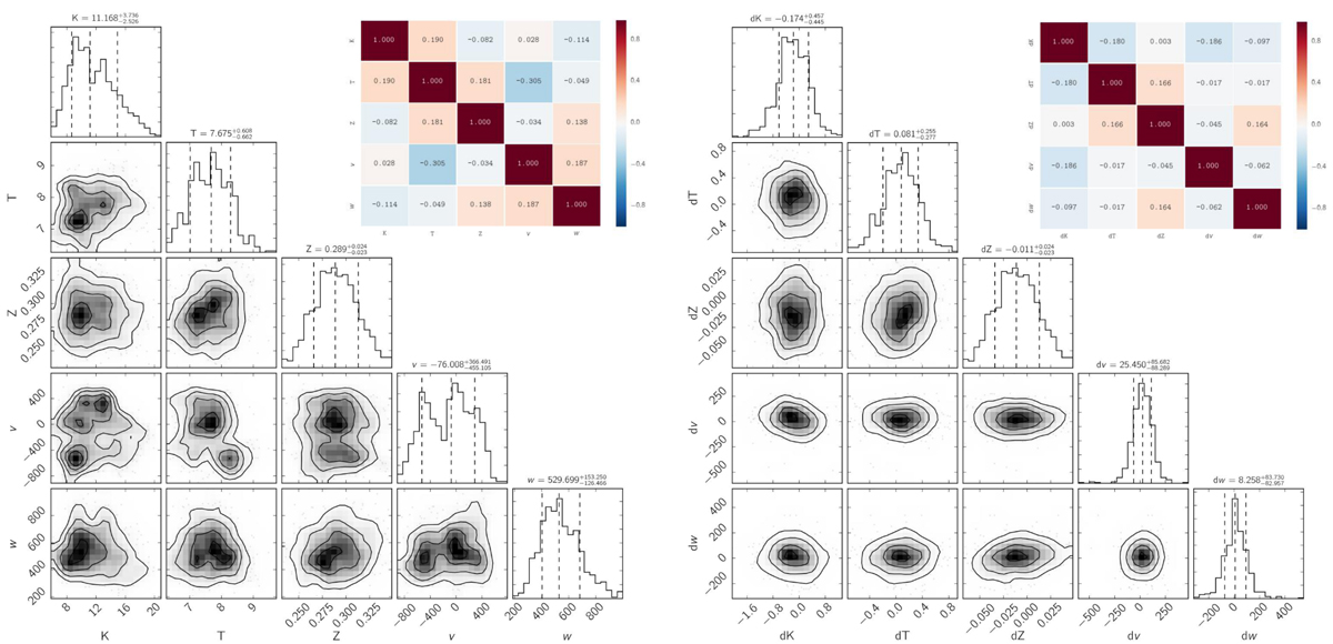
Left panel: corner plot and heat map for the measured best-fit spectral quantities in the case of ℳ = 0.75. The distributions (median, 1st and 3rd quartiles) and the correlations among the measured quantities are shown. The heat map is color-coded and indicates the level of correlations among the same quantities. Right panel: same as left panel, but evaluated using the differences between measured and reference values.
Current usage metrics show cumulative count of Article Views (full-text article views including HTML views, PDF and ePub downloads, according to the available data) and Abstracts Views on Vision4Press platform.
Data correspond to usage on the plateform after 2015. The current usage metrics is available 48-96 hours after online publication and is updated daily on week days.
Initial download of the metrics may take a while.