Fig. C.2.
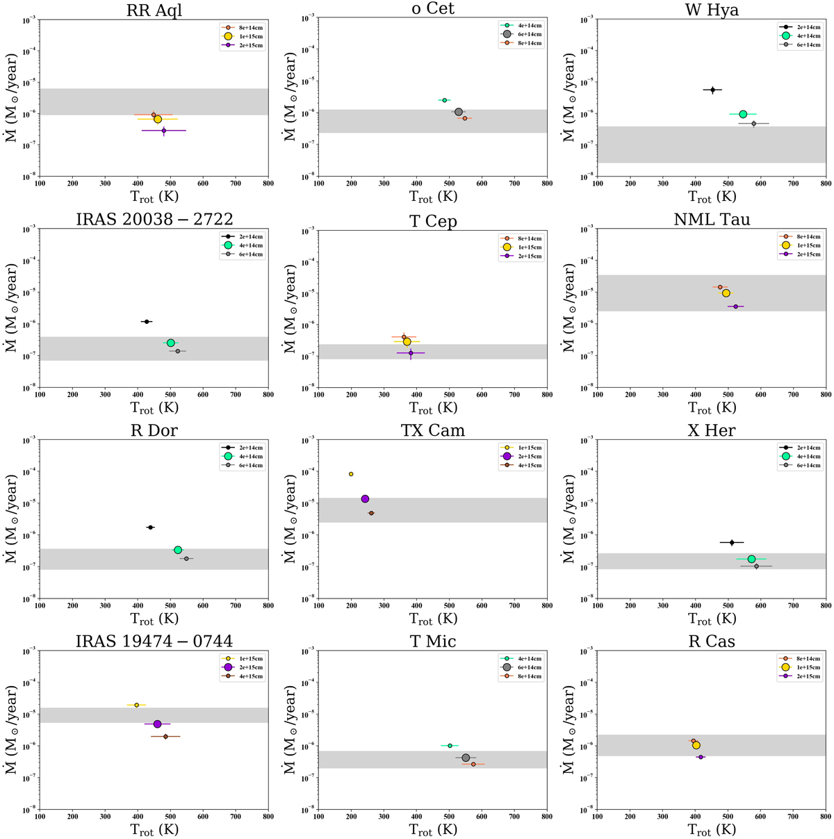
Plots of Ṁ vs. Trot. In each panel three different points, corresponding to three different rCO are shown. The point of the rCO shown in Table D.3 is bigger than the rest. The grey region represents the interval of mass-loss rates covered by previous works found in bibliography. For more details see Sect. 6. The linear radii explored are the same as the ones shown in Fig. C.1.
Current usage metrics show cumulative count of Article Views (full-text article views including HTML views, PDF and ePub downloads, according to the available data) and Abstracts Views on Vision4Press platform.
Data correspond to usage on the plateform after 2015. The current usage metrics is available 48-96 hours after online publication and is updated daily on week days.
Initial download of the metrics may take a while.