Fig. 3
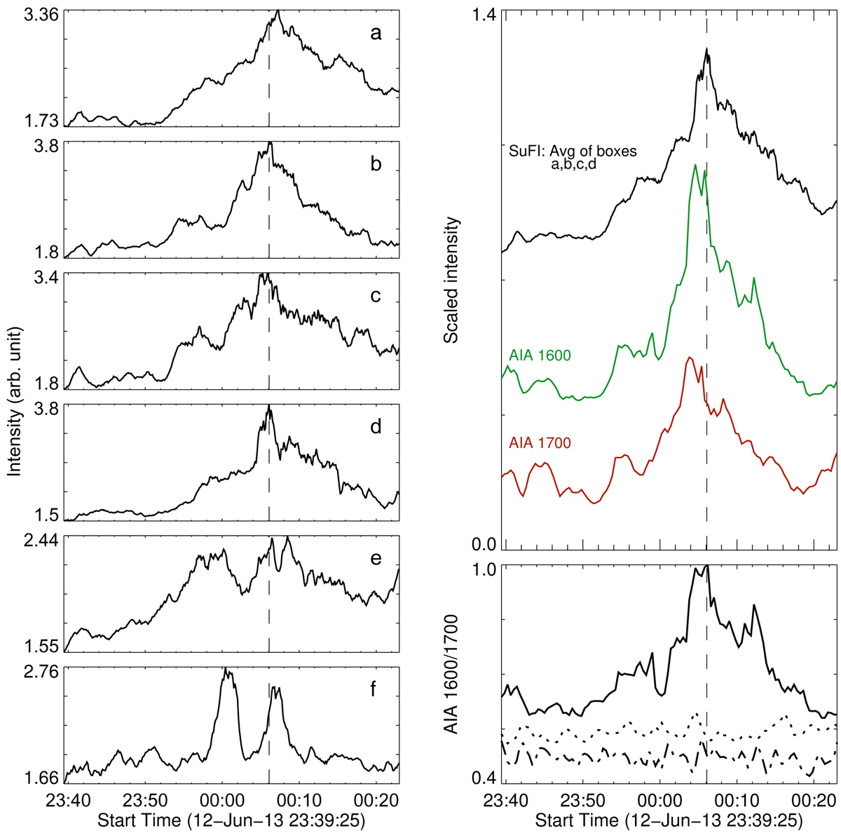
History of the burst from different subregions. Left: SuFI light curves a–f are average intensities from different subregions of the burst (see boxes marked a–f in Fig. 2). Top right: plotted in black is the average SuFI intensity from boxes marked a–d in Fig. 2. Green and orange light curves are average intensities as recorded by AIA 1600 Å and AIA 1700 Å filters from the solid yellow box, covering the burst displayed in Fig. 1. The solid curve in the bottom right panel is the ratio of average burst intensities from AIA 1600 Å and AIA 1700 Å filters, normalized to unity at the maximum. The dash-dotted curve is the same ratio, but for the filter ratio of average quiet Sun intensities from the solid cyan box in Fig. 1, and the dotted curve is for the magnetic concentration indicated by the black box. These two ratio curves are normalized to the maximum of the burst ratio curve to highlight the relative differences in the intensity ratios from the three regions. Vertical dashed lines are plotted as a guide to show the temporal correspondence between various light curves. See Sect. 4 for details.
Current usage metrics show cumulative count of Article Views (full-text article views including HTML views, PDF and ePub downloads, according to the available data) and Abstracts Views on Vision4Press platform.
Data correspond to usage on the plateform after 2015. The current usage metrics is available 48-96 hours after online publication and is updated daily on week days.
Initial download of the metrics may take a while.