Fig. 7
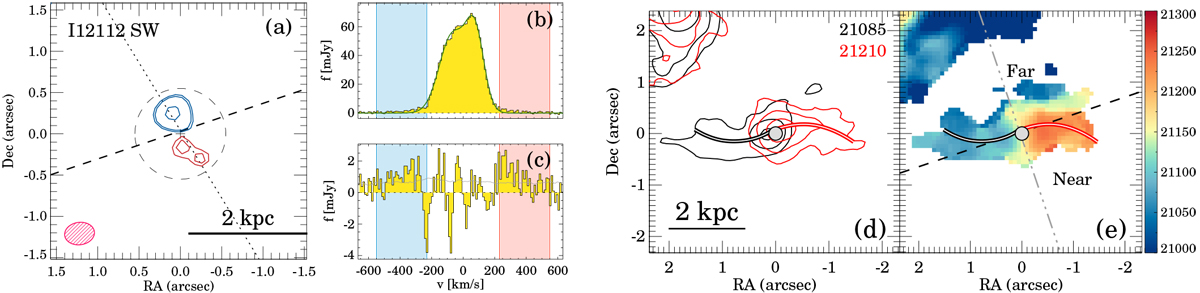
Blue and red contours in panel a represent the integrated blue- and red-shifted high-velocity CO(2–1) emission, respectively.The specific velocity range is listed in Table 6. The lowest contour corresponds to the 3σ level. The next contour levels are (0.5, 0.9) × the peak of the high-velocity emission when these are above the 3σ level. For I12112 SW, σ = 30 mJy km s−1 beam−1 and the red and blue peaks are at 110 and 240 mJy km s−1 beam−1, respectively. The dotted and the dashed lines are the outflow axis and the kinematic major axis, respectively (see Table 5). The red hatched ellipse represents the beam FWHM and PA. The dashed circle indicates the region from which the nuclear spectrum was extracted. Panel b: nuclear spectrum in yellow and the best-fit model in gray. Panel c: difference between the observed spectrum and the best-fit model. The shaded blue and red velocity ranges in these panels correspond to the velocity ranges used for the contours of panel a. The gray line in panel c marks the 3σ noise level per channel. Panel d: CO(2–1) emission at the velocities indicated by the numbers at the top-right corner of the panel as black and red contours, respectively. The black and red double lines trace the morphological features (spiral arms, tidal tails) observed at those velocities. Panel e: CO(2–1) mean velocity field (same as in Fig. 4). The black dashed line is the kinematic major axis and the gray dot-dashed line is the kinematic minor axis. The far and near sides of the rotating disk are indicated, assuming that the observed morphological features are trailing.
Current usage metrics show cumulative count of Article Views (full-text article views including HTML views, PDF and ePub downloads, according to the available data) and Abstracts Views on Vision4Press platform.
Data correspond to usage on the plateform after 2015. The current usage metrics is available 48-96 hours after online publication and is updated daily on week days.
Initial download of the metrics may take a while.