Fig. 8
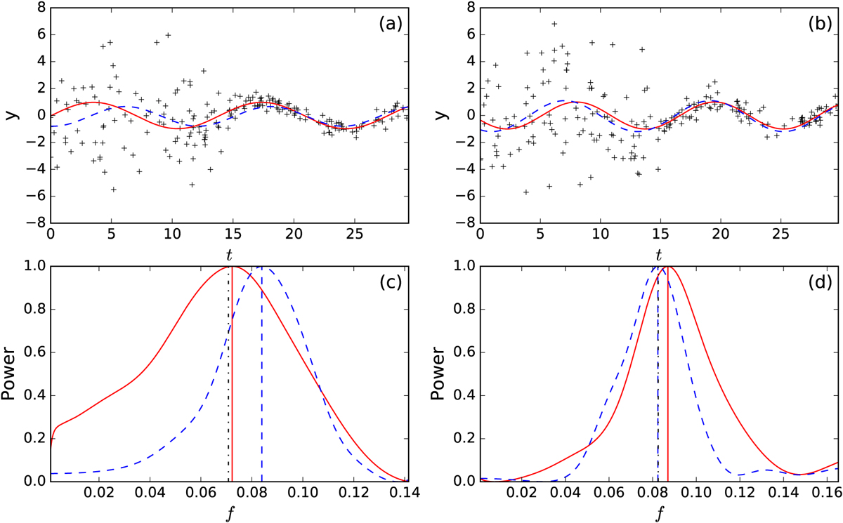
Comparison of the methods for experiment with set-up 2. Panels a and b: data points with black crosses, red continuous curve indicate the BGLST model, and the blue dashed line indicates the LS model fit. Panels c and d: spectra of the models with same colours and line styles. The vertical lines correspond to the optimal frequencies found and the black dotted line shows the true frequency. The plots on two columns correspond to the biggest difference in the period estimates from both methods w.r.t. each other. On the left the BGLST method outperforms the LS method, and on the right vice versa.
Current usage metrics show cumulative count of Article Views (full-text article views including HTML views, PDF and ePub downloads, according to the available data) and Abstracts Views on Vision4Press platform.
Data correspond to usage on the plateform after 2015. The current usage metrics is available 48-96 hours after online publication and is updated daily on week days.
Initial download of the metrics may take a while.