Fig. 12
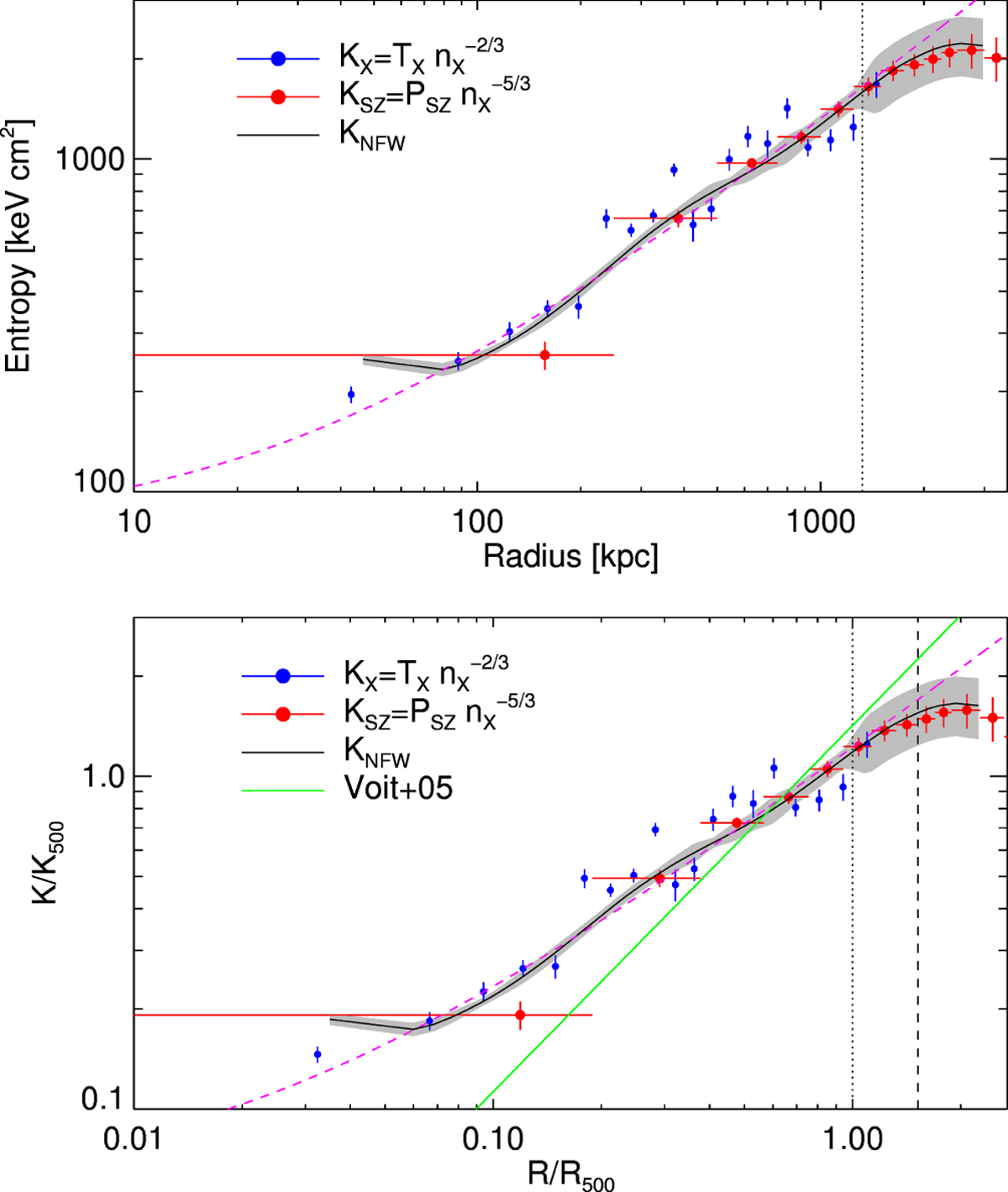
Top: entropy profiles obtained from the three different methods described in Sect. 4.5. The dashed magenta line represents the best fit obtained on the KNFW data using Eq. (9). Bottom: entropy profiles rescaled by K500. The dashed magenta line represents the best fit obtained on the KNFW data using Eq. (12). The green lines represents the prediction from Voit et al. (2005). The dashed pink lines are the best fit using Eqs. (9) and (12). The vertical dotted and dashed line represents the location of R500 and R200, respectively.
Current usage metrics show cumulative count of Article Views (full-text article views including HTML views, PDF and ePub downloads, according to the available data) and Abstracts Views on Vision4Press platform.
Data correspond to usage on the plateform after 2015. The current usage metrics is available 48-96 hours after online publication and is updated daily on week days.
Initial download of the metrics may take a while.