Fig. 6
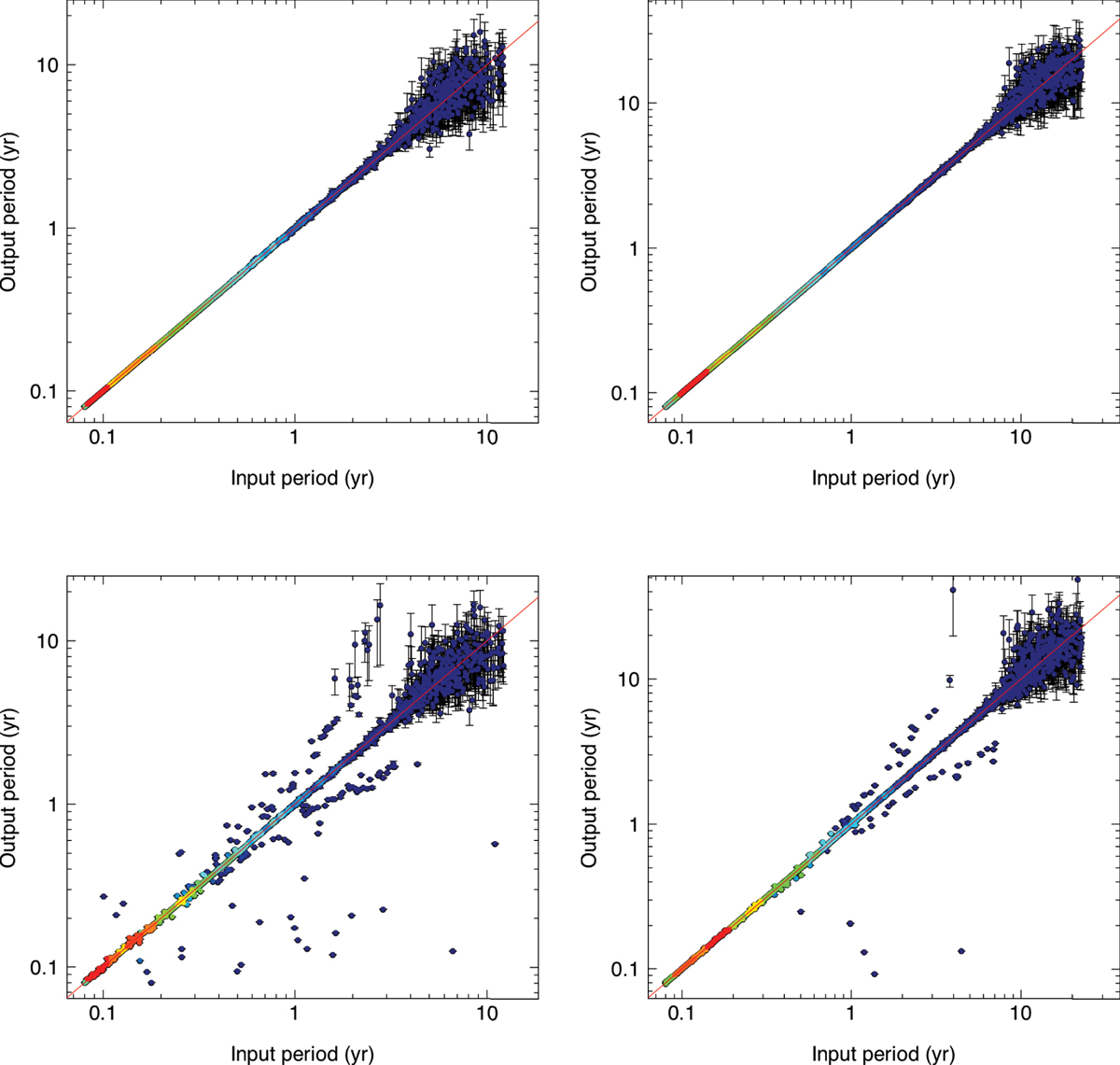
Simulated vs. recovered period. The left and right panels show the 5 yr and 10 yr missions, respectively. The upper and lower panels differ only for the starting point of the MC: the ideal case (MC started at the true value) in the upper panel, and the circular-orbit model best-fit point in the lower panel. The colours show the density of points where they overlap, going from blue (no overlap) to red (maximum overlap). The error bars show the 68.3% highest posterior density interval. The red solid lines show the one-to-one relationship. The period is correctly recovered in the majority of cases. The two sequences parallel to the main relationship are populated with systems that are incorrectly fit with edge-on, high-eccentricity orbits.
Current usage metrics show cumulative count of Article Views (full-text article views including HTML views, PDF and ePub downloads, according to the available data) and Abstracts Views on Vision4Press platform.
Data correspond to usage on the plateform after 2015. The current usage metrics is available 48-96 hours after online publication and is updated daily on week days.
Initial download of the metrics may take a while.