Fig. 3
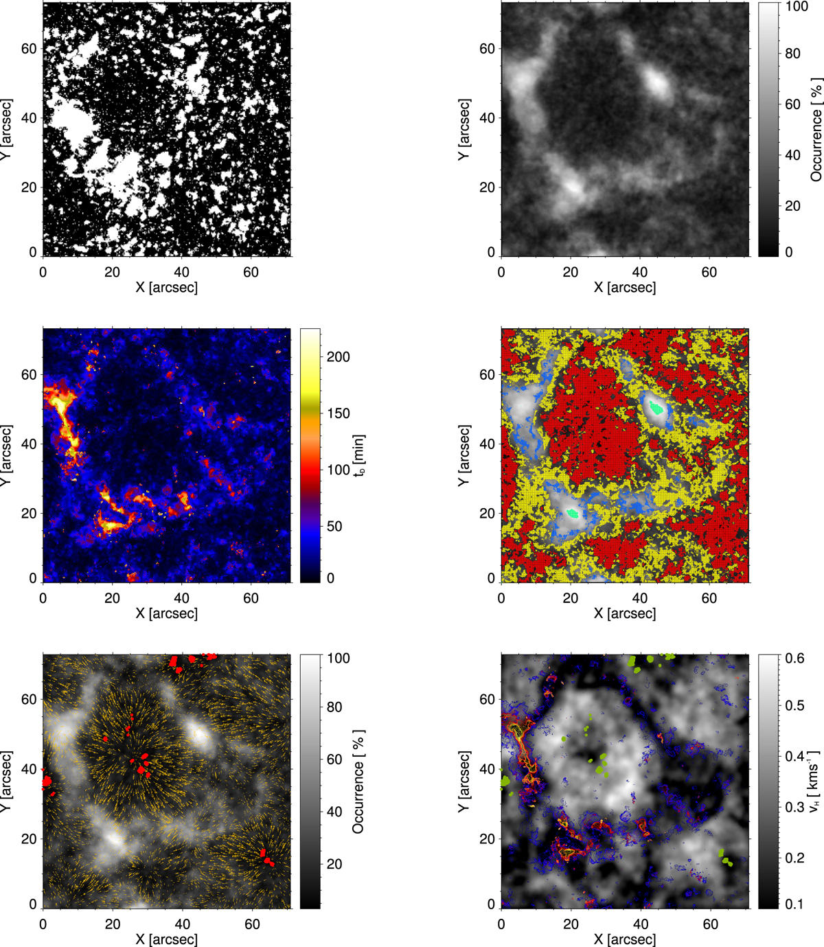
Top left: binarisation map of the first magnetogram of the series, i.e. acquired at 08:00:42 UT. Pixels in white are those with magnetic flux density Φ ≥ Φ T = 13 G. Top right: occurrence map of the FoV. Middle left: map of decorrelation times. Middle right: map of the different regions identified in Fig. 5 in red, yellow, blue, and green (see text) superimposed on the occurrence map. Bottom left: horizontal velocity field (gold arrows) computed with FLCT (Fisher & Welsch 2008) superimposed to the occurrence map. The red filled circles mark the locations with the lowest occurrences ( ≤5%). Bottom right: horizontal velocity strength map (grey scale). The decorrelation times map for tD > 20 min is superimposed with the same color code as in the middle left panel. The green filled circles mark the locations with the lowest occurrences ( ≤5%).
Current usage metrics show cumulative count of Article Views (full-text article views including HTML views, PDF and ePub downloads, according to the available data) and Abstracts Views on Vision4Press platform.
Data correspond to usage on the plateform after 2015. The current usage metrics is available 48-96 hours after online publication and is updated daily on week days.
Initial download of the metrics may take a while.