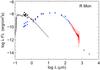
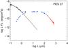
Fig. 3
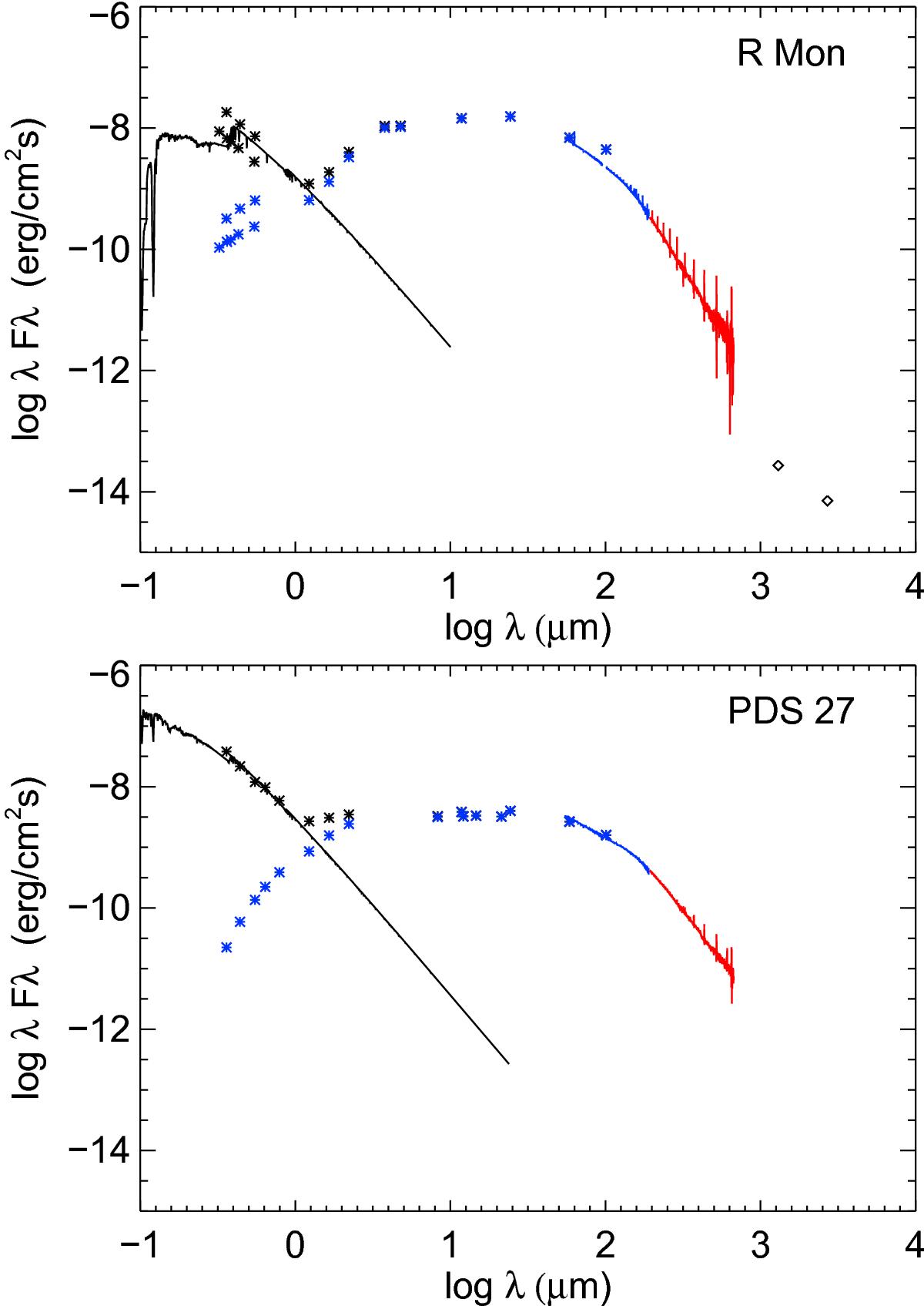
SED for R Mon (top) and PDS 27 (bottom), including our new PACS and SPIRE spectroscopy (red curves). We show the dereddened (black points) and the observed (blue points) fluxes. Overplotted are the Kurucz models (black curves). For R Mon we show the fluxes both in its brighter and fainter state. The millimetre data from Fuente et al. (2003) is shown in the upper panel as diamonds.
Current usage metrics show cumulative count of Article Views (full-text article views including HTML views, PDF and ePub downloads, according to the available data) and Abstracts Views on Vision4Press platform.
Data correspond to usage on the plateform after 2015. The current usage metrics is available 48-96 hours after online publication and is updated daily on week days.
Initial download of the metrics may take a while.