Fig. 11
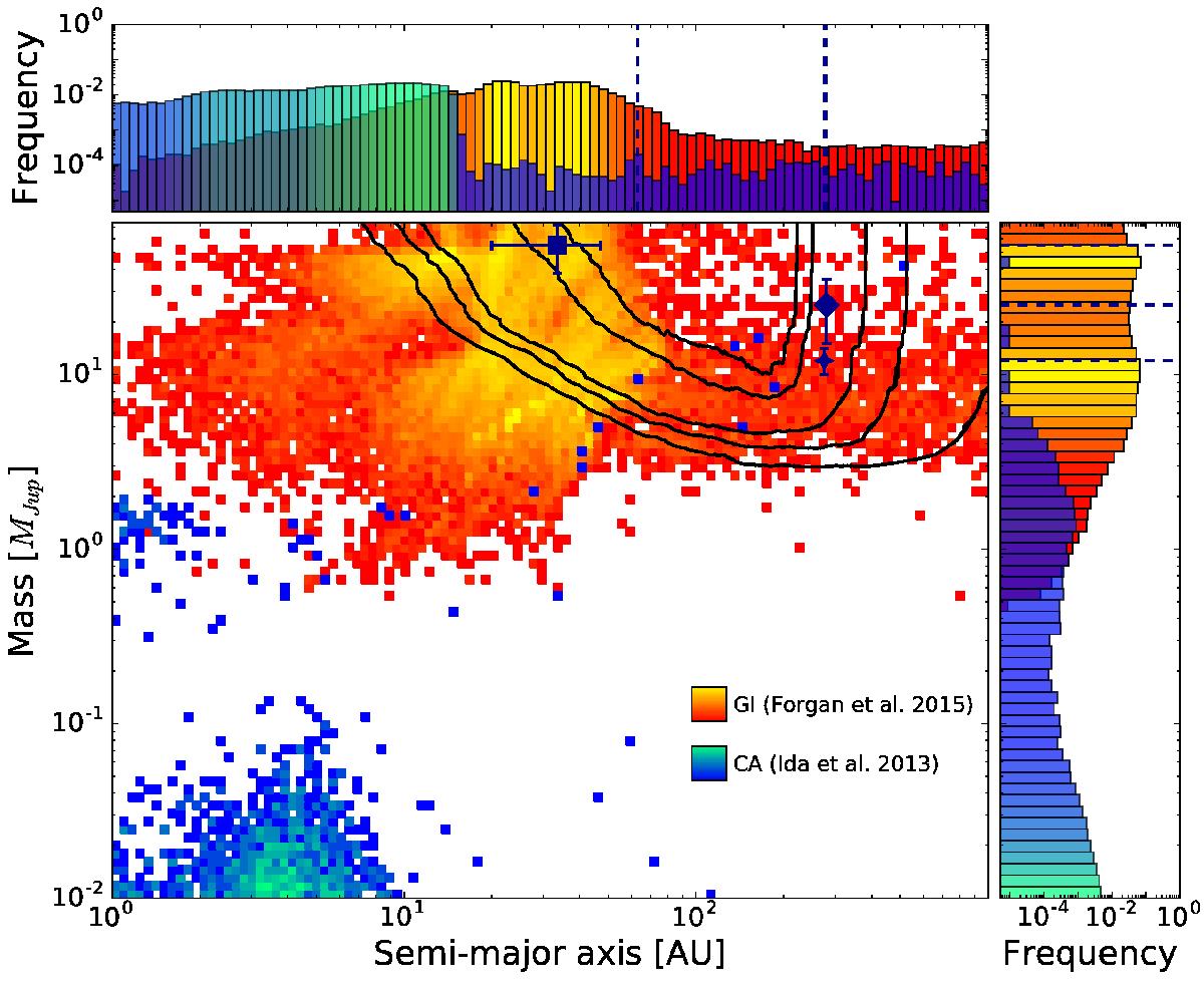
Density plots representing scattered populations based on GI (Forgan & Rice 2013; Forgan et al. 2015) and CA (Ida et al. 2013) compared to the detections in our sample and to the mean detection probabilities of the observations (contour lines are at 5%, 25%, 50%, 90%, and 95%). Density colors go from dark blue (low occurrence) to cyan (high occurrence) for the CA population, and from red (low occurrence) to yellow (high occurrence) for the GI population. The histograms on top and on the right represent the relative frequency in each bin of semi-major axis and planetary mass respectively. The histograms take into account the whole population, including the planets that are outside of the visibility window of the main plot. The semi-major axis and mass of the known companions are represented with dashed lines in the histograms.
Current usage metrics show cumulative count of Article Views (full-text article views including HTML views, PDF and ePub downloads, according to the available data) and Abstracts Views on Vision4Press platform.
Data correspond to usage on the plateform after 2015. The current usage metrics is available 48-96 hours after online publication and is updated daily on week days.
Initial download of the metrics may take a while.