Fig. 10
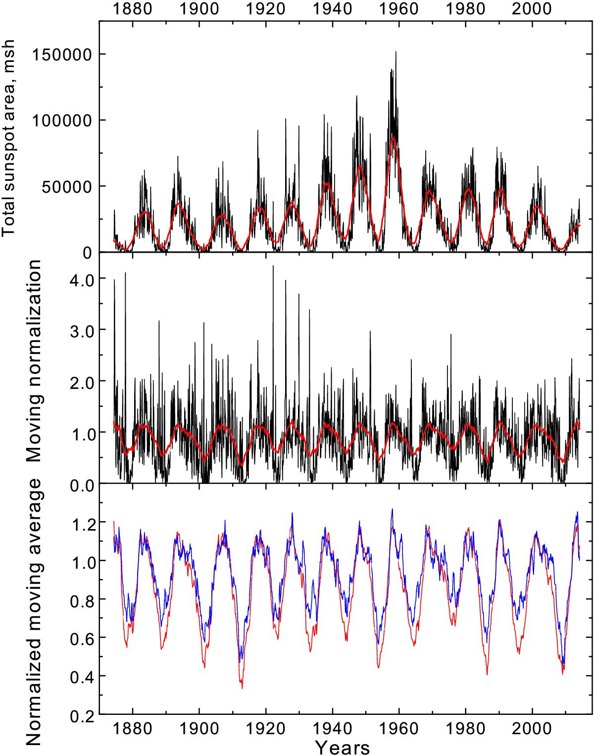
Top – N + S for total sunspot areas, the red curve represents four-year (49 months) moving average. Middle – N + S divided by ⟨ N + S ⟩ (moving normalization), the red curve is subsequent four-year moving average. Bottom – the red curve represents N + S (the same as on the middle panel), the blue curve shows the normalized moving average for | N−S |.
Current usage metrics show cumulative count of Article Views (full-text article views including HTML views, PDF and ePub downloads, according to the available data) and Abstracts Views on Vision4Press platform.
Data correspond to usage on the plateform after 2015. The current usage metrics is available 48-96 hours after online publication and is updated daily on week days.
Initial download of the metrics may take a while.